Monthly Archives: February 2014

Raspberry Pi as aTouchscreen Kiosk

I am currently downloading a web application onto a Rasperry Pi in the hope that it will work. The idea is to use dropbox to sync a web directory when the device loads up which will then be accessed by a touchscreen interface. All files are held and referenced locally so if the internet goes down there is no downtime for people in the gallery.

pi

The system is up and running already on a Mini-mac, and working well. Our problem is that only one Mini-mac in the gallery has an operating system that can run a modern browser such as chrome, which is needed to run the gallery app.

The main test is if the Chromium web browser on the Pi behaves in the same way as Chrome on the mac – if this fails we will need to rethink things – perhaps the javascript could be tweaked to make it work, but maintaining two versions of the app would be rather time consuming.

If and once the app works – the test will be one of perfomance and whether any css effects run too slow to make this a feasable replacement for the Mini-macs.*

* this blog post comes mid way through the project so some background information is needed: we are in the process of migrating a gallery interactive solution from a stand alone system into the main collections database. In doing so we are redeveloping the legacy flash-based applications into a more sustainable javascript web application. During the project it has become clear that new hardware is required in order to run modern web browsers, and the budget implications of replacing 14 mini-macs has got us experimentinf with the Pi.

Watch this space….

Installing Dropbox on a Raspberry Pi

Reviewing user research for museums and cultural institutions

Here at fffunction, we always work with clients to try to incorporate at least some user research into our projects. Often this will take the form of interviewing users from user segments which we’ve identified with clients (typically based on motivations and tasks) to test our assumptions and gain new insights.

When we started working with the Bristol Museums, Galleries and Archive service, we quickly discovered that the service has a strong research and evaluation team with a wealth of data at its disposal. Furthermore, the museums and cultural institutions sector in the UK has an ethos of open sharing of research amongst organisations. So given that the budget for the design and development of the new BMGA website for this financial year is tight, we made a call to limit the amount of research we did ourselves but to review relevant research which was available to us.

The main piece of research we used is the report from the second phase of a multi-phase research project from Culture24 called Let’s Get Real. Culture24 have worked with organisations throughout the UK’s cultural sector to help them define and measure success online.

The cover of a research report from Culture24 titled 'Let's Get Real 2'
Let’s Get Real 2: a research report from Culture24

In the kickoff for the project, the team’s instinct was that the website should focus on content to help visitors plan a visit to the museums in the group. Our review of the Let’s Get Real 2 research along with other research supplied by the museum from visitor surveys and some informal interviews which we conducted with visitor services staff in the service have shown us that this instinct is a good one.

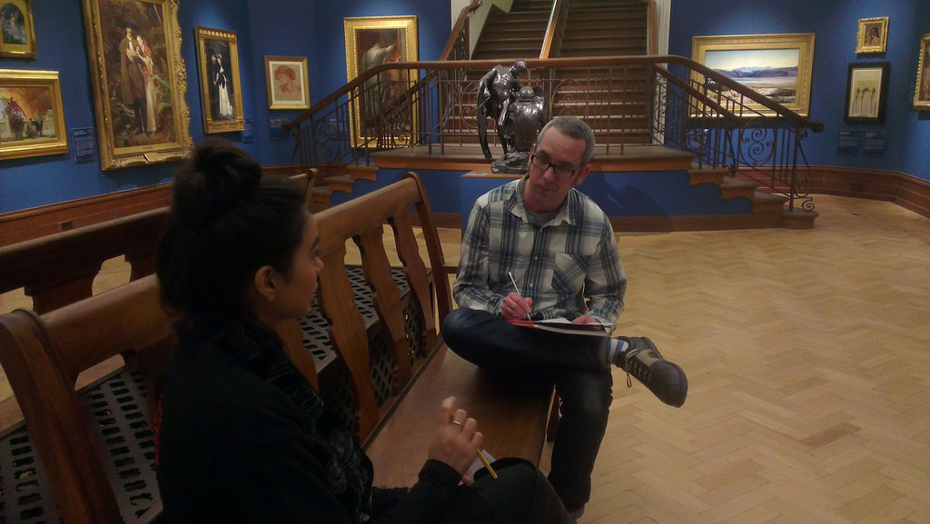
A user research interview being conducted at Bristol Museum
Dan from fffunction conducting a user research interview at Bristol Museum

So for the first phase of the website project, we’ll focus on content which supports visitors in planning visits. We’ll be bearing other tasks and motivations in mind and these will get more attention in later phases of the project, with more user research around them very likely.

New website project kick-off

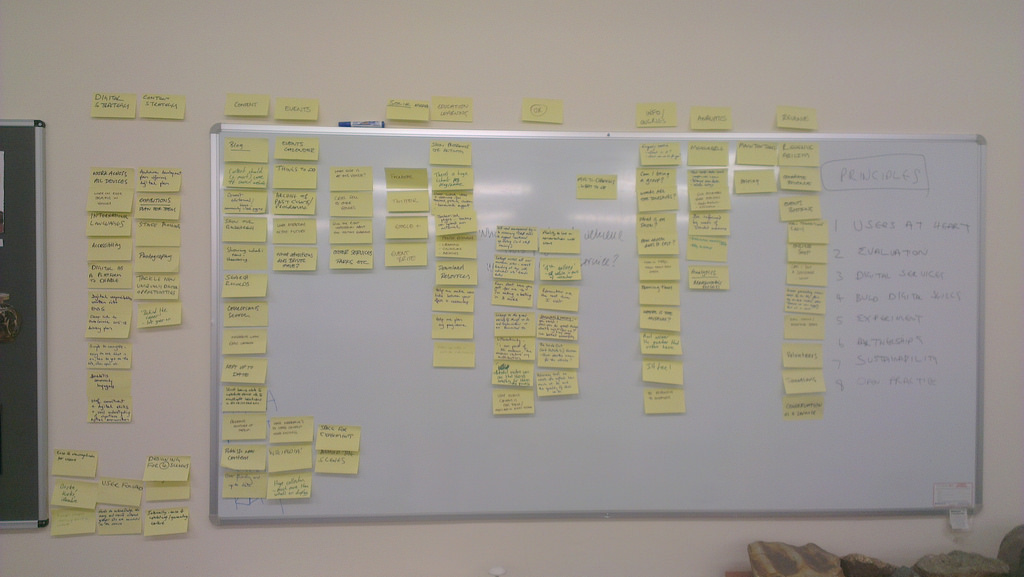
affinity diagram made from our notes
Affinity diagram – the result of considering audience and business needs

We receive over one million unique visitors to our two primary websites, the Bristol museum and Art Gallery museum section hosted on the Bristol City Council website and our own M Shed website. In addition to these two sites, we also have at least twenty other websites and online channels such as brerc, trip advisor, Bristol Record Office and multiple wikipedia entries. Combined, these sites also bring healthy traffic to parts of our service.
Despite having healthy traffic, it was clear that the websites had plenty of room for improvement, both for our audiences and our business needs. For example our internal processes mean that making changes is slow and awkward at best. We also regularly receive public feedback that we are missing key information and that its difficult to understand across the board. Our analytics, which measures web visits (what pages get visited, for how long and much much more!) suggests that current content and/or design is largely ineffective.
I had to write a business case for the first phase which included:

We are seeking to build a phased service-wide website for Bristol Museums, Galleries and Archives to address audience and business needs.
The website will cover all the museum sites and services and focus on evolving our currently unevenly distributed series of websites from a brochure website of static listings, and basic visitor information to a digital platform enabling audience focused tasks and service-wide digital engagement business  focused on addressing our needs beyond our current constraints.

Our website properties have become a destination in their own right for our audience.
During 2012-2013 online we attracted:

  • 1.1 Million unique page views (to the council section and M Shed but excludes our other sites and channels)
  • 20,000 Twitter followers
  • 6,500 Facebook likes
  • 4,500 Mailing list subscribers
  • 8% international audience

We seek to address the needs of both our existing and growing new user base by delivering digital services via the web in line with our strategic objectives. Our evaluation of our visitors through tracking, user surveys and staff feedback, identifies emerging usage trends which our current websites are failing to address to due to existing constraints.
Key performance indicators demonstrate that cost per transaction, user satisfaction, task completion rates and digital take-up must be addressed as a key business need.
The project will adhere to our 8 Digital Principles: Users at the heart, evaluation, digital services, build digital skills, experiment, partnerships, sustainability and open practices which is the start of a long-term commitment to digital delivery.

I met with a small group of recommended web agencies, mostly local, and chose fffunction. We agreed our approach should:

  • Be user focused
  • Be open not just internally but with the public too
  • Run the project in an agile way
  • Make use of the build, measure, learn feedback loop
  • Follow the GDS service  delivery approach oulined in the Service Manual of discovery, alpha, beta and finally live


The first part of the project is called the ‘project kick-off’ and was a day with four key internal stakeholders and fffunction.

We took a look at the biggest opportunities, ideas for direction and established obvious constraints such as time, budget and resource. We produced an affinity diagram (shown in this post) and put this into a public trello for everybody to see the ideas. This formally began the project ‘discovery phase‘ which GDS describe as “A short phase, in which you start researching the needs of your service’s users, find out what you should be measuring, and explore technological or policy-related constraints. will last for 3-4 weeks and cover.
We’ll be sharing more about the project in the coming weeks.