Our temporary exhibitions have around a 20% conversion rate on average. While we feel this is good (temporary exhibitions are either paid entry or ‘pay what you think’, bringing in much-needed income), flip that around and it means that around 80% of people are visiting what we call our ‘permanent galleries’ – spaces that change much less often than exhibitions. With a million visitors every year across all of our sites (but concentrated at M Shed and Bristol Museum & Art Gallery), that’s a lot of people.
A lot of our time as a digital team is taken up with temporary exhibitions at M Shed and Bristol Museum. Especially so for Zahid, our Content Designer, who looks after all of our AV and whose time is taken up with installs, derigs and AV support.
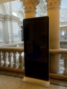
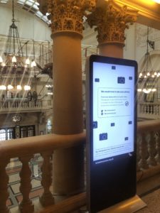
 But what about all of the digital interpretation in our permanent galleries? Focusing on the two main museums mentioned above, we’ve got a wide range of interp such as info screens, QR codes triggering content, audio guides and kiosks. A lot of this is legacy stuff which we don’t actively update, either in terms of content or software/hardware. Other bits are newer – things we’ve been testing out or one-off installs.
So, how do we know what’s working? How do we know what we should be replacing digital interp with when it’s come to the end of its life – *IF* we should replace it at all? How do we know where we should focus our limited time (and money) for optimal visitor experience?
We’ve just started some discovery phases to collate all of our evidence and to gather more. We want a bigger picture of what’s successful and what isn’t. We need to be clear on how we can be as accessible as possible. We want to know what tech is worth investing in (in terms of money and time) and what isn’t. This is an important phase of work for us which will inform how we do digital interpretation in the future – backed up by user research.
Discovery phases
We’ve set out a number of six week stints from August 2018 to January 2019 to gather data, starting with an audit of what we have, analytics and what evidence or data we collect.
We’ll then move onto looking at specific galleries– the Egypt Gallery at Bristol Museum and most of the galleries at M Shed which have a lot of kiosks with legacy content. (The M Shed kiosks probably need a separate post in themselves. They were installed for when the museum opened in 2011, and since then technology and user behaviours have changed drastically. There’s a lot we could reflect on around design intentions vs reality vs content…)
We’ll also be gathering evidence on any audio content across all of our sites, looking at using our exhibitions online as interp within galleries and working on the Smartify app as part of the 5G testing at M Shed.
We’re using this trello board to manage the project, if you want to follow what we’re doing.
Auditing our digital interpretation
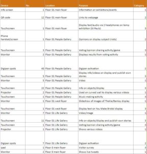
First off, we simply needed to know what we have in the galleries. Our apprentice Rowan kindly went around and scoured the galleries, listing every single thing she could find – from QR codes to interactive games.
We then categorised everything, coming up with the below categories. This has really helped to give an overview of what we’re working with.
| Key | Level of interaction | Examples | User control |
| 1 | Passive | Auto play / looping video, static digital label, info screens | User has no control |
| 2 | Initiate | QR code / URL to extra content, audio guide | User triggers content, mostly on own or separate device |
| 3 | Active | Games and puzzles, timeline | User has complete control. Device in gallery |
We then went through and listed what analytics we currently gather for each item or what action we need to take to set them up. Some things, such as info screens are ‘passive’ so we wouldn’t gather usage data for. Other things such as games built with Flash and DiscoveryPENs (accessible devices for audio tours), don’t have in-built analytics so we’ll need to ask our front of house teams to gather evidence and feedback from users. We’ll also be doing a load of observations in the galleries.
Now that people have devices in their pockets more powerful than a lot of the legacy digital interpretation in our galleries, should we be moving towards a focus on creating content for use on ‘BYO devices’ instead of installing tech on-site which will inevitably be out of date in a few short years? Is this a more accessible way of doing digital interpretation?
Let us know what you think or if you have any evidence you’re happy to share with us. I’d be really interested to hear back from museums (or any visitor attractions really) of varying sizes. We’ll keep you updated with what we find out.
Fay Curtis – User Researcher
Zahid Jaffer – Content Designer
Mark Pajak – Head of Digital


