We’ll be writing a short update each day about how M Shed shop refit is progressing. Ahead of the refit the wider team used Basecamp to discuss the new shop design and for all decision approval. Lots of time has been spent recently on the finer details including bay depth, lighting of bays, till location and opportunities for adding value in the design. Let’s go!
Pssst you can read about our last refit changelog at Bristol Museum & Art Gallery in 2018 which has since sales increase 51% in 12months
Friday 5th July
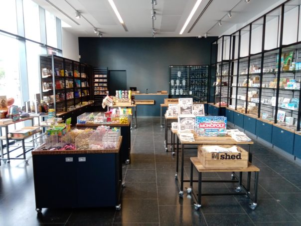
install Trim, slat, glass doors, locks, first lit bay, clean, merchandise…open 16:30 and took our first sale (#236160 for £29.44 to tourists).
Thursday 4th July
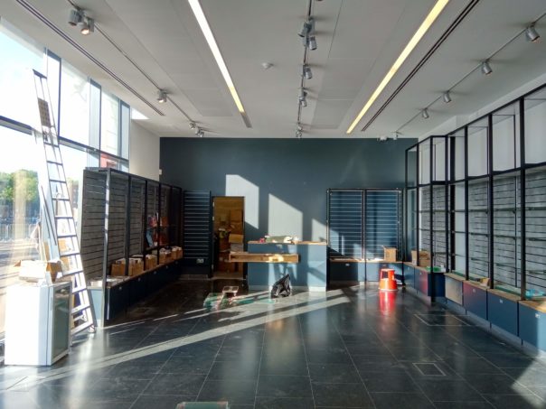
At the beginning of the day I was quietly confidently telling folks we’ll be done by end of Friday. Not 100% all singing and dancing and not a minimum viable product (MVP) but “good enough” to trade. Im not sure anyone believed me though (chuckles) as on the surface it did look far off. However much of that was due to the tools/cutting areas giving the impression of being far off.
Our electrician did a stellar job of getting power running to the till area and completing the wiring of the bay lighting and TVs. The bay lighting isn’t hooked up yet but this will be completed early next week and doesn’t pose an issue to trade over the weekend.
The shop fitters completed the final bays and slat wall. At the same time a few helpful hands (THANKS!) added the glass shelving. We only had a few book shelves on-site but ARJ-CRE8 super kindly have arranged for the rest to be delivered on Day 5. We started to pack down the temporary pop-up shop and transfer products to their new homes. By the end of the day we were all tidying up ready for a deep clean tomorrow morning. I was even reunited with my favourite tool, the pallet truck (long standing joke!) which we put to good use – a pallet truck is the workhorse of moving “stuff” with ease.
Helen and I will make a call about re-opening the shop tomorrow (end of the day) but I can’t see why we won’t be in that position by lunchtime… last big push which is mainly going to be getting product out.
Thanks to everyone who has been giving words of support, lending a hand or making jokes!
See you at 7am to help us move products right?
Wednesday 3rd July
Day 3 was very productive!
The shop fitters were able to complete the perimeter bays as shown below. Above the bays we’ve decided to make frames to hold graphics and tighten up the brand. I originally wanted to have digital screens but the cost didn’t outweigh the benefits and we can use some of our historic photos from around the harbour. Also the team didn’t like my idea which is fine!
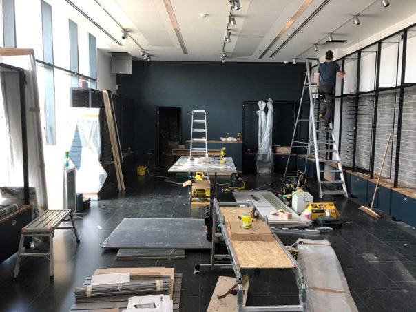
In addition to some more decoration our brilliant in-house electrician had his first day on the project. He has the task of working out how best to power the LED bay lights, till area and our digital screens that will be behind the till. With the welcome news that the shop fitters expect to be finished early, our timeline has moved up. I asked Rob to focus first on powering our till as I have my fingers crossed we can then trade Friday. Once the till (shown below) has power we “can” be in business. After the till lighting the bays is the second priority then finally our digital screens.
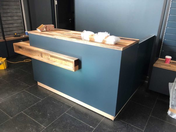
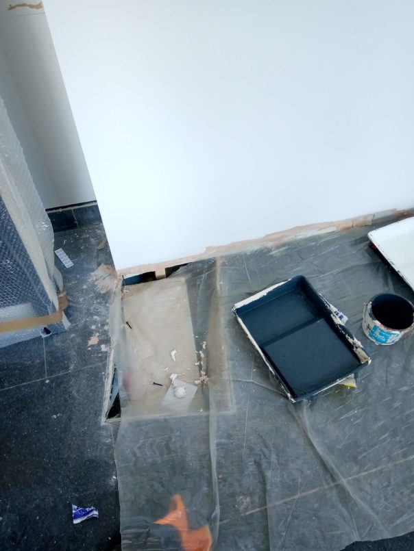
In the above photo there is a giant hole in the floor! This was under a bit of wall we removed and that needs to be “made good” so thankfully our ever awesome operations team arranged for a steel plug to be made today to save the day. Snags are always going to crop up and having professionals all around you makes them disappear pretty quickly. The hole needed to be filled as 1/2 of a bay unit was due to be installed at that spot.. thanks everyone who kicked into action to resolve today.
Our graphics have also gone to the printers today and will be installed Monday. In a project like this I’d much rather add new elements one by one rather than have tried to push too hard for all elements and contractors to work around each other. Having the project be ahead gives even greater buffer. Onwards!
Tuesday 2nd July
Day 2 has been rapid and already has enough done to see it coming together in real life as opposed to doodles and words! One set of contractors set about decorating and also building a new room to support our back of house function for the museum. Our design team chose the colour scheme which is designed to reinforce the brand and make the products shine.
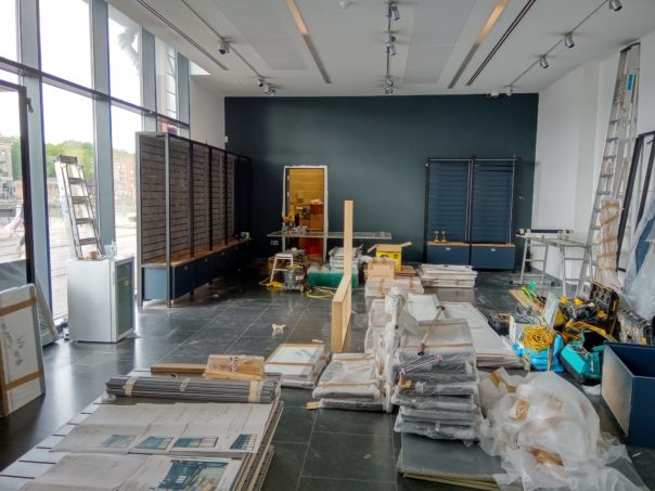
The shop fitters concentrated their efforts on installing the window bays and even found time to begin on the far back wall. More fittings arrived too such as glass shelving, our new custom marble table and other book tables. We expect each table to generate £5,000+ in annual sales.
We made a design decision to install bays directly in front of our windows across most of the space instead of retaining a “view” from the outside into the shop. We initially wanted to retain the “view” into the shop or use beautiful visual merchandised displays. However the displays required too much space which would reduce our shop floor area by 1m+. And keeping windows would eliminate our ability to increase overall “shoppable” space which is the aim of the game. We also took advice from a professional Visual merchandiser and between us the recommendation was “bays over beauty”. If it doesn’t add valuable then don’t do it. In the end a sensible comprise for budget reasons and to still retain some natural light at eye level was to have bays on the sides and keep the central of the windows open.
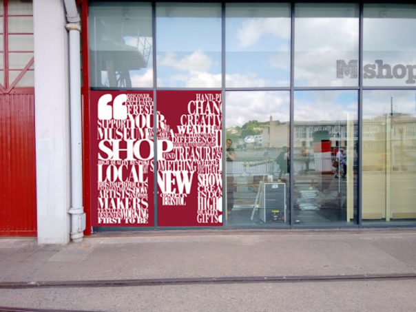
The decision to put bays in the window produced a new opportunity for us. We are now able to place graphics on the windows to promote our shop offer. Originally we planned to apply the graphics to the inside of the windows but missed the window of opportunity (bad joke) so instead will apply to the outside of the windows. This is actually a blessing in disguise as it now means we can change the graphics more frequently without a lengthy process of having to remove the bays to work. Below is the draft design we will send to the printers this week. You’ll see that two windows are to remain free and “viewable” from the outside. Natural light will still come in from the top panes.
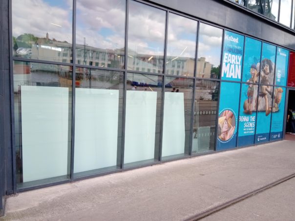
In the windows that are in the foyer area there is the opportunity to expand beyond promoting retail to help explain what M Shed is and what we have on offer. Tomorrow i’ll ask our designer Fi what is possible in the four bays shown below.
Monday 1st July
ARJ-CRE8 arrived on site at 07:00 and were greeted by our Retail Manager Helen. Today’s schedule was to focus on the stripe out the current old shop fittings. The photo below shows a bare shop within just a few hours. Claudia and Helen spent the day helping where possible and getting our temporary pop-up shop ready.
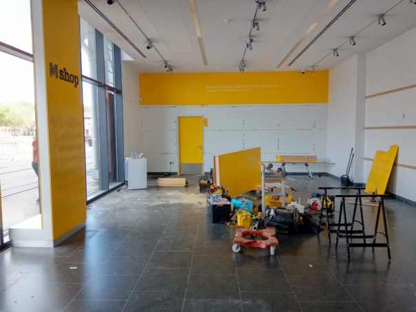
Once the old shop was stripped out the team then brought in lots of the new shop bays and fittings. At the same time, anther company were moving various sensors and alarms as we need to re-site lots of “bits” that were built into the original reception area. Fi, our 2D designer was also finalising graphics for the walls and windows. Onwards!
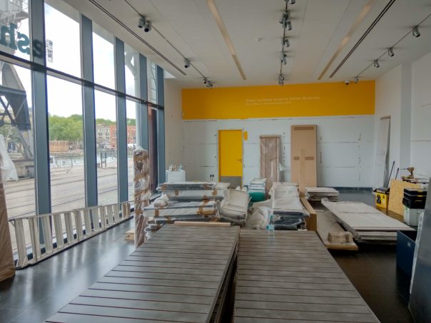
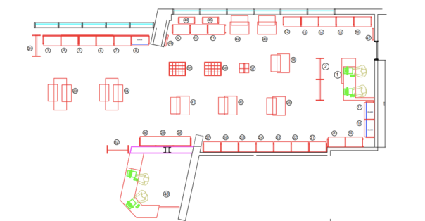
Sunday 30th June
The last day of the current shop as we know it. Once the shop closed at 5pm a number of the team packed away all products on display. Products were either moved to the temporary “pop-up” shop area in the foyer or moved upstairs to our meeting room which is acting as our transit space during the project. At 07:00 the shopfitters from ARJ-CRE8 will be on-site to begin the project proper. Let’s hope the skip arrives earlier at day 1 is largely taking out the existing shop fittings and fixtures.