This post has been written by Sarah Matthews, our digital designer here at Aardman Animations:
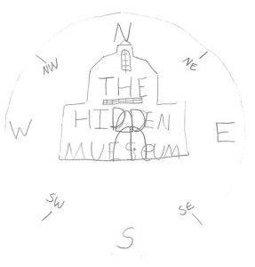
Today I’ve been working on some logo designs. I started off by looking through some of the children’s logo drawings from when they visited the museum during our ‘Kids in Museums’ user testing day, and came a across a cute sketch of the museum itself.
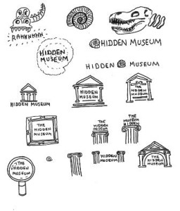
The building is quite iconic, and I thought this would be easily recognised as a generic logo, no matter what the content of the museum. I’ve looked at the main building as an outline, and then at the display pillars, as these seem to be universally used.
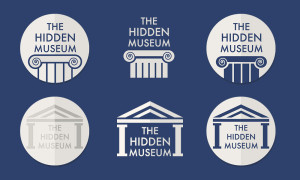
After playing with a couple of variations, I started to work within a circle as I felt this matched the style of the app, and this could also help when it’s placed on different coloured backgrounds.
It’s still early days, but thought it would be nice to share our work in progress. We’ll keep you updated as it develops!

