Category Archives: Websites

Google Arts & Culture: an overview…also, what is it?

I have been working on the development of the Bristol Museums partner page with Google Arts & Culture for close to two years, and in October it finally went live!
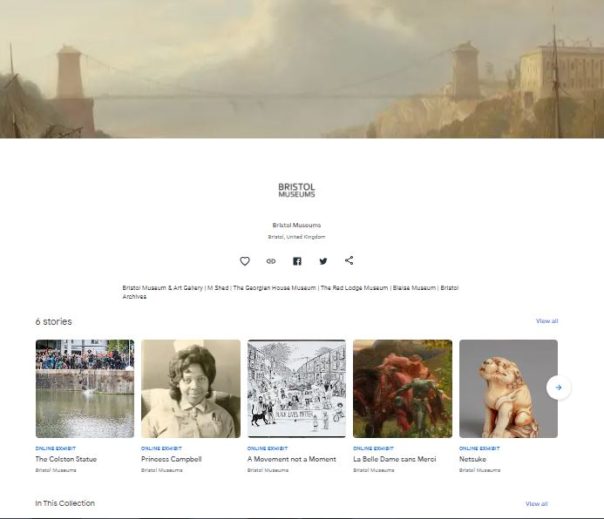
Screenshot of the Bristol Museums Google Arts & Culture partner page. Header image is a painting of the Clifton Suspension Bridge and highlighted are the Online Exhibits.

Some background info about my involvement

I started working on this as a trainee on the Museum Futures programme in January 2020, this was actually one of the first projects that I participated on. Originally designed as a partnership with South West Museum Development , the idea behind it was that we would develop a page for Bristol Museums and then bring this (and the process guides) to smaller museums as a way to support getting their collections online. However, it was mutually decided that this process was more convoluted than anyone first assumed, and that didn’t end up happening.

As of April 2021, I have continued to work on this in my current role as Digital Collections Content Coordinator – a position funded by the Art Fund – as part of a larger project to make our collections accessible online. Thanks Art Fund!

This project has not necessarily gone to plan. We originally aimed to launch at some point in summer 2020. We were then offered to be a part of the Google Arts & Culture Black History Month 2020 campaign if we were ready to launch by that October. While we first worked towards meeting the deadline, we ultimately decided against going ahead with this plan as we had to rush, and we felt that these stories deserved a much longer preparation time than we could give them at that stage. Also, we felt that we didn’t need to be a part of the campaign in order to tell these stories. 

What is Google Arts & Culture?

Google Arts & Culture is still fairly new and unknown territory, and there seem to be a number of (understandable) misconceptions about what its purpose is. Is it social media? Is it an alternative to Collections Online? Is it a blog? Can we signpost to events and the shop?

No, sort of but not really, no and no. 

This doesn’t really sound appealing, does it?

The best comparison we can make is to a Collections Online service, but less extensive. And it’s shared by lots of other organisations. And also other organisations can use our images. (Yikes! But bear with me.)

It is described as an online platform through which the public can view high resolution images of objects in museums and galleries. This is accurate, does what it says on the tin. 

You might know Google Arts & Culture from the Art Selfies trend (which I would recommend checking out if you’re not easily offended, as the comparisons are usually NOT KIND) or the chance to zoom in reeeeeally close to Rembrandt’s The Night Watch. These are two of the platform’s jazzy features that haven’t really been seen anywhere before, at least not in the same way. 

Why do we want to use it?

They use incredibly sophisticated software to automatically attach these functions to uploaded content, which is good for us because it means we don’t have to do anything special to get them to work for our objects. By using the highest quality TIFFs that we have for the objects we’ve selected, we can zoom in to brushstroke level on these works and use attention grabbing features like an interactive timeline. 
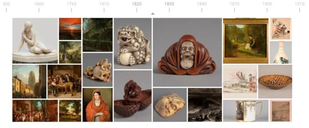
Image of the interactive timeline on the Bristol Museums Google Arts & Culture page. Date range starting at 500 AD and ending at 1910

I mentioned before that other people can use our images. This sounds like a big no-no, but bear with me (again). 

When creating an exhibition or a story you can use content that you’ve previously uploaded, but you also have the opportunity to use images shared by other organisations. This is often used if an org is creating a story about a specific subject and they don’t have enough content/images to contextualise, they can use images that have been uploaded to the platform previously. As all images already have clear rights acknowledgements and redirect to the partner page they belong to, this does not breach anything nasty. 

The benefit of this is that the reach one image could potentially have is boundless, and thus, the reach of our page also has the potential to be boundless.

What do we do if they kill it?

Well, it wouldn’t be ideal. We wouldn’t lose much content, and we won’t lose any data as this all came from our CMS anyway. We don’t rely on this to attract the bulk of our audiences and we’ve approached it as a bit of an experiment. It would be a shame to lose it, but it’s so new that I honestly can’t say how much of an impact that it would have, so I suppose we’ll just have to wait and see.

What has the process been to make it a thing here?

LONG. This process has been full of learning curves and a lot of troubleshooting. There is much to be said for data consistency and quality at internal database level when working on projects such as this. Arguably, one of the longest processes is assessing groups of content to ensure that what you’re including meets data requirements. But it has been fun to experiment and uncover a process that is now…somewhat…streamlined – which looks a bit like this:

  1. Find cool things on the database
  1. Export cool things using a self-formatting report that you’ve spent weeks developing in Visual Basic (groan)
  1. Find images of cool things and group those
  1. Export images of cool things using another self-formatting report that you’ve spent weeks developing in Visual Basic (more groaning)
  1. Stitch together image metadata and object metadata
  1. Add in descriptions and dimensions data manually because of data quality issues and duplicates that you have to assess on a case by case basis
  1. Upload fully formatted and cleaned dataset to a Google Drive as a Google Sheet
  1. Add in rows from new dataset into the Google Sheet that you’ve been provided with, because instead of uploading individual CSVs (which it says you can do but this option does not work) you have to use one spreadsheet and refresh it every time you make additions from the Cultural Institute (Google A&C back end)
  1. Upload images to Google Bucket 
  1. Refresh spreadsheet from the Cultural Institute  
  1. Fix all of the errors that it comes up with because it’s a buggy system 
  1. Refresh again
  1. Repeat steps 11 and 12 as needed

So…not exactly streamlined but in fairness, I have ironed out all of the kinks that I am capable of ironing out. The systems designed by Google are more archaic in practice than I was anticipating (sorry Google, no shade) and the small yet very irritating tech issues were real roadblocks at times. And yet, we persevere.

There will always be a level of manual work involved in this process, as there should be when it comes to choosing images and reviewing content, but I think that this does highlight areas where we could do with giving our database some TLC – as if that’s an easy and quick solution that doesn’t require time, money and other resources…

We aren’t sure what the future of the Bristol Museums partner page looks like just yet, especially with a few projects in the works that might help us bridge some of the gap that Google Arts & Culture is helping to fill. At the very least, I’ve learned a fair bit about data movement and adaptability.

Do have a look! This was a labour of love and stubbornness. Maybe let us know what you think?

This work was made possible by a Respond and Reimagine grant from The Art Fund

Improving our Users Experience and Data driven decisions: Digital User Research at Bristol Culture

Introduction


I’m George, a new member of the team on a year fixed term contract, coming from a background of website UX and other IT technical experience. My former role had a high focus on web standards, accessibility and a lot of ownership over what with publish but following guidance. I have taken a big curiosity over how we meet user needs with our digital and online web content and why. One of the easiest ways we really know what our users want is by measuring our data, and analysing its successes.

I was very grateful to have an opportunity when I joined the team, to be a part of Culture24‘s Let’s Get Real project (Supported by Arts Council England). And was gladly thrown into a positive working community of other museums and professionals alike who assisted me and complimented my existing knowledge. In this blog i’ll cover some of the things I aimed to achieve throughout its time, how I achieved it and now how it is being used in our daily activities.

The project and my experiments led to a discovery of what data is important to our organisation and also paved the way of thinking of how can we use this data to consistently read and improve on our digital output.

To begin, I created a dashboard using Google Data studio to measure all our web stats and also experiments, at first I wasn’t too sure of it being easy to read at a glance, so I kept making improvements on my first version and getting feedback and testing from business and my team.

Web stats dashboard: Screenshot of the current version of our data dashboard

Now with a way to measure my experiments, I started my first idea with to add another static header button for newsletter sign ups (and measure its effectiveness of converting site users to newsletter sign ups).

Website header CTA buttons: Addition of newsletter option, which is 0 cost to the user sign up and then getnotified of everything we do – events, shop products and venue reopening times.

During this experiment I felt I could do more, I felt the need to have something more tailored to the user and what page they were viewing and looked at using page targeted pop ups for my second experiment.

Building a dashboard measure success

Before and during experimenting we needed to ensure we could visualise the data of our results.
We could of course use analytics, but we found this was not time efficient and had many different routes to find our information. The use and development of one google dashboard allowed us to build and expand upon needs of the organisation through data driven decisions and evidence.

From the whole of one domain and it’s page views, where users come from before coming onto the site (referrals), a timeline graph of noticeable hits and a map to show what different regions, countries and cities are viewing what pages the most and for how long – the use of a bespoke designed dashboard would accomplish this. And it shouldn’t need you to be a analytics genius.

I tried several different designs initially but tried to keep in simple, user friendly and at a glance. Once the design elements and graphs were in place, it was easy enough to create more of these and filter to specific organisation need. One notable website I added has exceptionally interesting and notable data for our organisation: discoveringbristol.org.uk.

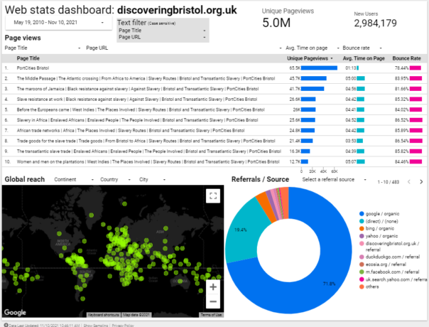
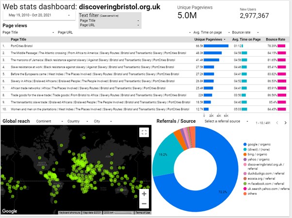
Noting the below dashboard, it has users across the world, a great average reading time and approx. 5million page views. However we feel it could use an update to reflect more modern times and tech.

Web stats dashboard: 5million hits and worldwide users on discoveringbristol.org.uk

But what more can we do with this data? There is a clear need by the pageviews to provide more historical content not just to the local or national viewers of our site – a worldwide web audience.

Understanding our users and what they want

The timeline graph below shows the most viewed events web pages since September 2019.
Do note the almost flatline number of page views from March 2020 – when COVID lockdown begun.

Timeline graph of pageviews: A noticeable impact due to covid on our events pages

As a result of our venues closing we could predict that visitor donations, online ticket sales, in venue shop sales and visitors who relied on our noticeboards or promotions using banners would decrease.
 
And an opposite effect is there has been more of a demand to have a stronger web presence, offer online events and exhibitions, keeping our audiences up to date with what we’re doing etc.

It’s this thinking which gave me the idea as part of Let’s Get Real to experiment with trying to convert users to donations, shop sales or newsletter sign ups as this could help the impact that COVID has had on our organisation.

Experiments

Experiment one: Adding ‘Newsletter’ button alongside 2 other header buttons

Problem: Newsletter underperforms as an ‘outbound event click’ in Google Analytics compared to Shop/Donate buttons
Solution: Add extra button alongside static buttons within website header
Expected outcome: To increase newsletter clicks and gain bigger mailing list for future promotions
Considerations: May decrease other 2 buttons clicks as 3 options
Result: Newsletter clicks are performing better than donations clicks

Summary:

We had 2 CTA buttons for Shop and Donate. I suggested to add a ‘Newsletter’ button link as shown:

Header buttons: Shop/Donate/Newsletter – We needed to offer a 0 cost option to our users

We implemented the google tag manager tracking of all these event clicks from Jul 2nd.
At the same time, we added the button for Newsletter to our live site as shown above.
The first two buttons require a cost – buying or donating money. I felt we could be more inclusive.

For other users of certain demographics, for example those who are younger, disadvantaged, lower incomes, the very least we could offer them is a way to be notified by our work via email newsletter. This should offer just that – a way to interact and keep involved with us.

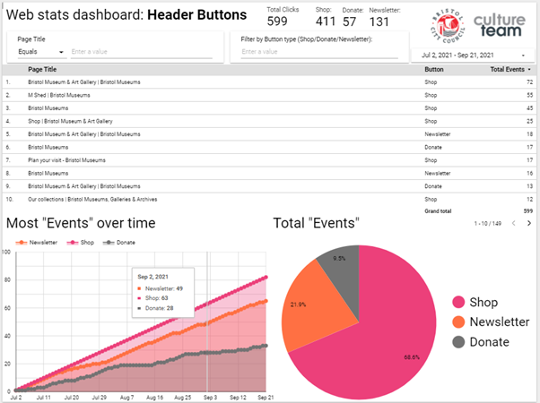
 Web stats dashboard: Header Buttons: Shop/Donate/Newsletter – Area and Pie (page) chart

The above screenshot showed us our users prefer to go to our shop, then click our newsletter link and then lastly donate. The table shows what pages had the most clicks to which buttons.

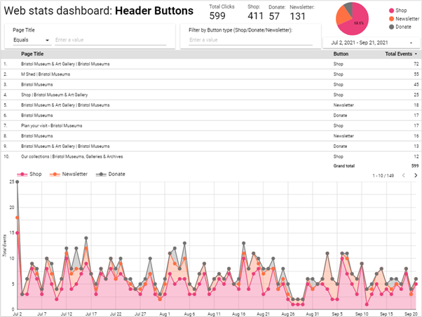
Here is our second page of the same report, with different data charts to help visualise the results:

Web stats dashboard: Header Buttons: Shop/Donate/Newsletter – table and timeline chart

Conclusion:

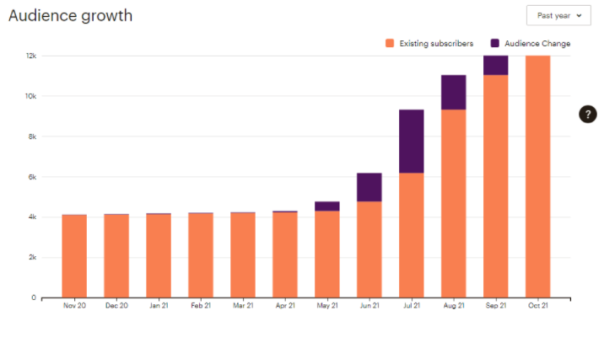
We have seen a major increase in newsletter sign ups since I joined in March and made these changes:

Mailchimp newsletter: Audience growth 30-11-20 to 30-11-21


Given the year of lockdown and restrictions to visit public venues, combined with data such as large page views of our venue opening times before announcements to drop restrictions, sending our users direct updates to their mailbox seemed like a better way to notify attendees.

I feel this was better than have them navigate to our site to check updates as they have been frequently changing and potentially delayed or disrupted – potentially out of date.

As these buttons are within the header area, the first things seen before reading content, and are present across all pages of the site. The opportunity to sign up is given to the user to click these whenever, regardless of the content they are viewing.

Once we added the button, we have found an increase of clicks to the newsletter sign up, where this could be a user chooses after reading the page to intentionally sign up to keep notified and updated of the museums via email newsletter.

This is a positive safeguard to prevent them missing out on more information and general relevant news which could decide or impact their attend the museum in the future.
As this was a static button this gave me the idea for my next experiment: page targeted pop ups.

Experiment two: Page targeted pop ups for The Colston WHN exhibition/survey

Problem: Inability/lack of control to target users to a specific goal campaign or CTA that interactively prompts them during their reading – static buttons already in place for our more generic targets
Solution: Find and install flexible page pop ups tool and launch with testing alongside relevant and suitable campaign/topic. In this case Colston Exhibition and Black History web pages
Expected outcome: Users see a pop up relating to page content topic and will click on the pop up as its relevant to their interest.
Considerations: ‘pop ups’ generally considered an annoyance/disruptive/negative impact
Result: Effective – content that readers have chosen to view get suggested to take an action.
This was successful as the target pages had content relevant to the suggested action in the popup

Page targeted popups: CTA prompt used for TCS: What Next survey, exhibition and campaign

Summary:

We needed a way to drive existing readers of our Black History content to the Colston statue survey.
I researched different ways to prompt users and looked at a plugin called Boxzilla pop ups.
It was obvious that users reading our Black History content would actually take the survey and also offer good, valuable feedback – if they were suggested to.

But how would these users who land on our History pages know about the Colston survey or exhibition if they were just on the article/story they had chosen to read? A box that prompts them during their reading, with a well phrased call-to-action that appears halfway through their reading.

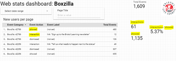
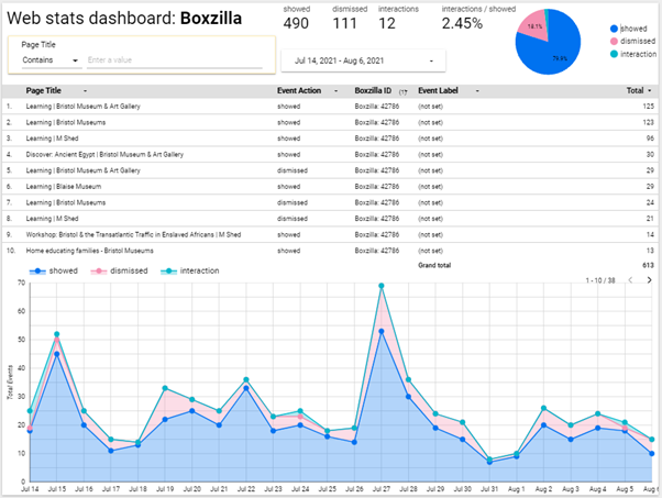
We also needed to measure this which is what the plugin we added could offer us. This tied in with the google dashboard, where we see how many were shown, interacted and dismissed.

Popup dashboard: Measuring success on showed/interaction/dismissed data

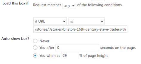
First we needed a list of pages we needed to target, we then set the box pop up to be seen on all of those page URLs when the user scrolls above 55%. By default the box type is on the bottom right of the screen.  We can then set the expiry of the pop up if necessary, which is useful for if it is running beside a campaign – for example this could be for a donations campaign or a shop sale.

Popup settings: Where and how we can set the popup prompts

These parameters are all pretty self-explanatory and offer the option to be more present to the users viewing experience if necessary, however for the sake of less intrusion to the user and a bad experience it typically seems better to have a ‘less is more’ approach as it may seem intrusive.

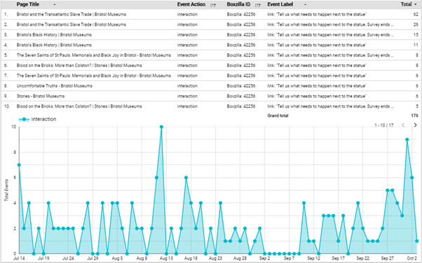
Popup dashboard: Timeline total of actions taken on the popup for Colston survey campaign

Conclusion

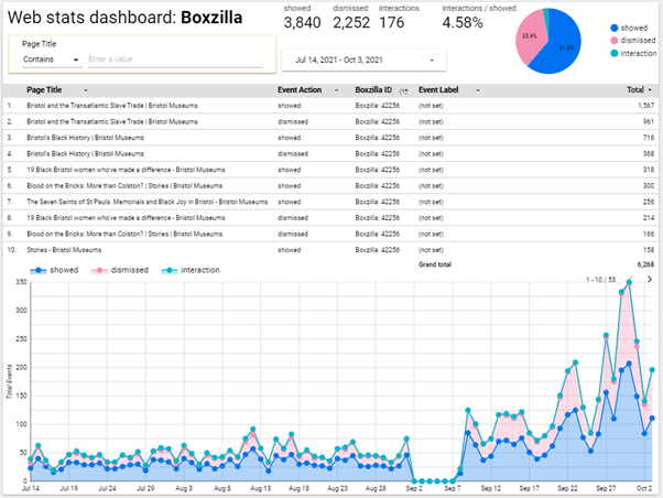
Generally speaking, as long as the pop up call-to-action is directly relevant to the page content itself then it’s more likely that the user will not ignore or close the prompt. The longer the exhibition went on, the more popups increased too.

The last part of the campaign we saw a massive increase which is likely linked to general pubic awareness of the survey campaign, alongside the organisations other comms and other promotions plans to do with the survey. The ‘last chance’ message was likely more encouraging too.

Popup dashboard: Total interactions on the Colston Survey, July 14 to Oct 2
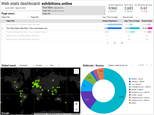
Survey page data: Pageviews and referral data

In comparison to the more general, static newsletter button CTA which are at the top of the page and then scrolled past (and likely missed). A popup that prompts for something like newsletter specifically is more likely to be ignored as it may be intrusive due to no direct relevance to their reading content and they have already seen it as a static button. Also, popups do not return unless the page is refreshed.

Popup dashboard: Total actions taken on the popup of Newsletter – non-specific campaign

 I think it can be useful to have a pop up newsletter but if the same users are looking at them repeatedly,  it could be intrusive and possibly an annoyance – I am in belief with more testing it can be set to not show popups to those already signed up to their newsletter (via mailchimp newsletter integration).

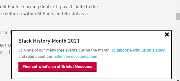
Popup: Used for Black History Month to drive users to events/feedback and our decol statement

For now, ultimately, alongside other campaigns ongoing within the organisation this has great potential to assist those by keeping users already on our website directed to other parts and to convert readers into actions.

CV19 – Digital Battle Plans

Background

Bristol Culture receives an average of 2.5 million yearly visits to its websites (not including social media). Additionally, we have different demographics specific to each social media channel, which reflect the nature of the content and how users interact with the platform features offered.

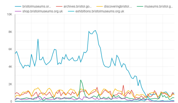
Since March 13th visits to the bristolmuseums.org.uk have fallen off sharply from a baseline of 4000/day to under 1000/day as of 6th April. This unprecedented change in website visitors is a reflection of a large scale change in user behaviour which we need to understand, presumably – due to people no longer searching to find out about visiting the museum in person, due to enforced social distancing measures. It remains to be seen how patterns of online behaviour will change in the coming weeks, however, it appears we have a new baseline which more closely matches our other websites that are more about museum objects and subject matter than physical exhibitions and events.

You can explore this graph interactively using the following link:

https://datastudio.google.com/reporting/196MwOHX1WOhtwDQbx62qP0ntT7sLO9mb

Before CV struck

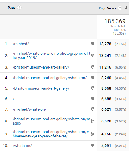
The top 10 most visited pages in January on bristolmuseums.org.uk feature our venue homepages, specific exhibitions and our events listings

online stats January 2020

During Lockdown

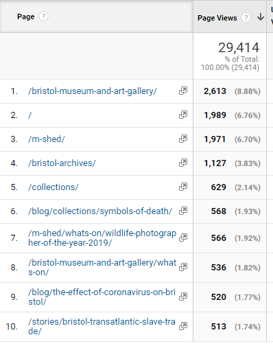
From March-April we are seeing visits to our blog pages, our online stories and our collections pages feature in the top 10 most visited.

online stats March 16th-April 9th

Digital Content Strategy

Internally, we have been developing a digital content strategy to help us develop and publish content in a more systematic way. The effect of CV-19 has meant we have had to fast track this process to deal with a large demand for publishing new online content. The challenge we are faced with is how to remain true to our longer-term digital aims, whilst tackling the expectations to do more digitally. In practice, we have had to rapidly transform to a new way of working with colleagues, collaborating remotely, and develop a new fast track system of developing and signing off digital content. This has required the team to work in different ways both internally, distributing tasks between us, but also externally across departments so that our content development workflow is more transparent.

Pre-quarantine online audiences

Online we follow our social media principles: https://www.labs.bristolmuseums.org.uk/social-media-principles/

A key principle of our audience development plan is to understand and improve relationships with our audiences (physical and digital). This involves avoiding the idea that everything is for ‘everyone’. Instead of recognising that different activities suit different audiences. We seek to use data from a range of sources (rather than assumptions) to underpin decisions about how to meet the needs and wants of our audiences. 

Quarantine online audiences

Since the implementation of strict quarantine measures by the Government on Tuesday 24th March – audiences’ needs have changed.  

  • Families at home with school-age children (4 – 18) who are now home-schooling during term-time.
  • Retired people with access to computers/smart-phones who may be isolated and exploring online content for the first time.
  • People of all ages in high-risk groups advised not to leave their homes for at least the next 12 weeks.
  • People quarantining who may be lonely/anxious/angry/bored/curious or looking for opportunities to self-educate. 
  • Possible new international audiences under quarantine restrictions.

See this list created anonymously by digital/museum folk: https://docs.google.com/document/d/1MwE3OsljV8noouDopXJ2B3MFXZZvrVSZR8jSrDomf5M/edit

What should our online offer provide?

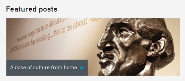
https://www.bristolmuseums.org.uk/blog/a-dose-of-culture-from-home/

Whilst our plummeting online visitors overall tells us one story – we now have data to tell us there is a baseline of people who are visiting our web pages regularly and this audience needs consideration. Potentially a new audience with new needs but also a core group of digitally engaged visitors who are seeking content in one form or another.

Some things we need to be thinking about when it comes to our digital content:

  • What audiences are we trying to reach and what platforms are they using? 
  • What reach are we aiming for and what are other museums doing – we don’t necessarily want to publish content that is already out there. What’s our USP? 
  • What can we realistically do, and do well with limited resources?
  • What format will any resources take and where will they ‘live’? 
  • What’s our content schedule – will we be able to keep producing this stuff if we’ve grown an audience for it once we’re open again? When will we review this content and retire if/when it’s out of date?
  • We need to be thinking about doing things well (or not doing them at all – social media platforms have ways of working out what good content is, and will penalise us if we keep posting things that get low engagement. A vicious cycle)
  • We want to engage with a relevant conversation, rather than simply broadcast or repurpose what we have (though in practice we may only have resource to repurpose content)

Submitting ideas/requests for digital content during Quarantine period

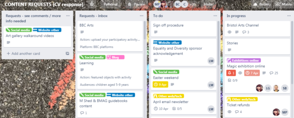
We are already familiar with using trello to manage business processes so we quickly created a new board for content suggestions. This trello-ised what had been developing organically for some time, but mainly in the minds of digital and marketing teams.

Content development Process in trello

STEP 1: An idea for a new piece of digital output is suggested, written up and emailed to the digital team, and then added to the Digital Content Requests Trello.

STEP2: The suggestion is then broken down / augmented with the following information (detailed below), and added as fields to the trello card

STEP 3: This list of suggestions is circulated amongst staff on the sign off panel, for comments.

STEP 4: The card is either progressed into the To Do List, or moved back to “more info needed / see comments” list.

The following information is required in order to move a digital content suggestion forward:

Description: Top level description about what the proposal is

Content: What form does the content take? Do we already have the digital assets required or do we need to develop or repurpose and create new content? What guidelines are available around the formats needed?

Resource: What staff are required to develop the content, who has access to upload and publish it?

Audiences: Which online audiences is this for and what is their user need?

Primary platform: Where will the content live, and for how long? 

Amplification: How will it be shared?

Success: What is the desired impact / behaviour / outcome?

Opportunities 

Experimentation

New and emerging content types: The lockdown period could be an opportunity to try a range of different approaches without worrying too much about their place in the long term strategy.

Online events programme

Now we can only do digital-or-nothing, we need to look at opportunities for live streaming events. Where there is no audience – how do we build enough digital audiences to know and be interested in this if we did go down that route. Related to above – online family/ adult workshops, a lot of this is happening now, are they working, how long will people be interested?

Collaborating with Bristol Cultural organisations

With other cultural organisations in Bristol facing similar situations, we’ll be looking to collaborate on exploring:

  • What is the online cultural landscape of Bristol?
  • Collaborative cultural response to Corona
  • A curated, city wide approach
  • Working with digital producers on user research questions
  • Similar to the Culture ‘Flash Sale’
  • Scheduled content in May

Arts Council England business plan

Those projects are at risk of not being able to be delivered –  can digital offer a way to do these in a different way?

Service / Museum topical issues

How can we create an online audience to move forward our decolonisation and climate change discussions?

Family digital engagement  

We’ll be working with the public programming team to develop content for a family audience

Examples of museum services with online content responding well to quarantine situation

a) they have a clear message about the Corona virus situation

b) they have adjusted their landing pages to point visitors to online content.

Examples of museums with good online content generally

Recent Guardian article by Adrian Searle lists museums for digital visits https://www.theguardian.com/artanddesign/2020/mar/25/the-best-online-art-galleries-adrian-searle

Fundraising

The Development Team typically manages around £12,800 in donations per month through ‘individual giving’ which goes to our charity, Bristol Museums Development Trust. This is from a variety of income streams including donation boxes, contactless kiosks, Welcome Desks and donations on exhibition tickets. Closure of our venues means this valuable income stream is lost. To mitigate this, we need to integrate fundraising ‘asks’ into our online offers. For example, when we promote our online exhibitions, ask for a donation and link back to our online donation page. 

The Development Team will work with the Digital and Marketing teams to understand plans and opportunities for digital content and scope out where and how to place fundraising messages across our platforms. We will work together to weave fundraising messages into the promotion of our online offers, across social media, as well as embed ‘asks’ within our website. 

Next Steps:

Clearly, there will be long-lasting effects from the pandemic and they’ll sweep through our statistics and data dashboards for some time. However – working collaboratively across teams, responding to change and using data to improve online services are our digital raison d’etre – we’ll
use the opportunity as a new channel for 2020 onwards instead of just a temporary fix .

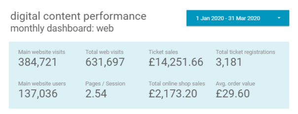
snapshopt of digital stats before the pandemic

The week our office turned into a photography studio!

With one of the main aims this year being to improve our online shop, myself and Darren decided to improve and update some stock photos. We enrolled in a crash course from resident photographer David Emeney and by the end of session thought we’d be able to do it, easy.

However, we came to find that photography is not as easy as it seems! First came the issue of space. Although David kindly allowed us to use his studio in the basement, with no computer nearby to check pictures and in fear of messing with any of his equipment, we though it may be best  if we set up a studio a little more close by.IMG_20170109_154103292_HDR

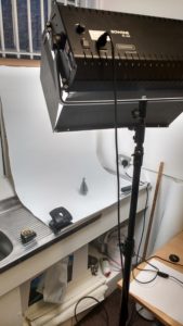
In true Blue Peter style Darren and I set about creating our own in-office photography studio by collecting bits and pieces from around the museum to mirror the one in the basement. Cardboard tubes were stapled together acting as a rod to hold the white background in place, this was held up by string wrapped multiple times around our window bars, counter tops were cleaned as to not make the paper dirty and even a staff noticeboard was used behind the paper to block out any natural light. Of course our office had to be rearranged first to fit such a project inside, a move which would have me non-stop sneezing for a few days as the settled dust was disturbed!

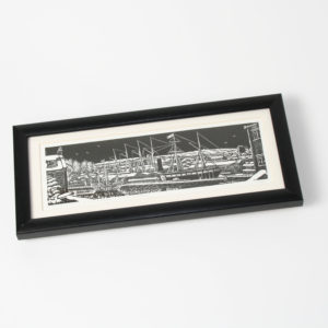
After a while of playing with the camera’s settings trying to find the right ones, we set to work to photograph stock. With thanks to Debs for letting us borrow geology’s light, the products came out well and the online shop now looks a lot smarter for it. Having this type of light was key to taking a good image, the close proximity between the product and source of light and changing the camera’s white balance when needed added extra quality.

It was a really good experience getting to know the manual settings of a camera and how each product requires a slight adjustment, also to be up to date with what products we currently have in store. I look forward to doing more stock photo shoots in the future and hope, at some point, to have all products photographed like this to keep a consistent look for the online shop.

£70 stoneSSGB edt 4559warrior duck 4857

Getting an archival tree-view to sort properly online

The digital team at Bristol Culture face new challenges every day, and with diverse collections come a diverse range of problems when it comes to publishing online. One particularly taxing issue we encountered recently was how to represent and navigate through an archives collection appropriately on the web.

Here’s what Jayne Pucknell, an archivist at the Bristol Record Office, has to say:

“To an archivist, individual items such as photographs are important but it is critical that we are able to see them within their context. When we catalogue a collection, we try to group records into series to reflect their provenance, and the original order in which they were created. These series or groups are displayed as a hierarchical ‘tree view’ which shows that arrangement.”

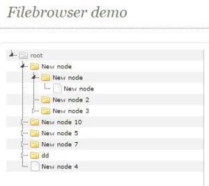
So far so good – we needed to display this tree-view online, and it just so happens there is a useful open source jquery plugin to help us achieve that, called jsTree.

Capture

The problem we found when we implemented this online, was that the tree view did not display the archive records in the correct order. The default sort was the order in which the records had been created, and although we were able to apply a sort to the records in our source database (EMu), we were unable to find a satisfactory sorting method that returned a numerical sort for the records based on their archival reference number. This is because the archival reference number is made up from a series of sub-numbers reflecting sub collections.

So this gave us a challenge to fix, and the opportunity to fix it was possible because of the EMu API and programming  in between the source database and collections online.  The trick was to write a php function that could reorder the archive tree before it was displayed.

Well, we did that and here’s a breakdown of what that function does:

The function takes 2 arguments – the archival number as a text string, and the level in the archive as an integer.

1.) split the reference number into an its subnumbers
2.) construct a new array from the subnumbers
3.) perform a special sort on the new array that takes into account each subnumber in turn

in theory that’s it – but looking at the code in hindsight there are a whole heap of complexities that would take longer to articulate here than just to past in the code, so lets make it open source and leave you to delve if you wish – here’s the code on Github

Another subtle complexity in this work is described further by Jayne:

“You may search and find an individual photograph and its catalogue entry will explain the specific content of that image, but to understand its wider context it is helpful to be able to consider the collection as a whole. Or you may search and find one photograph of interest but then want to explore other items which came in with that photograph. By displaying the hierarchy, you are more easily able to navigate your way through the whole collection.”

Because of the way our collections online record pages are built – a record does not immediately contain links to all its parents or children. This is problematic when building the archives tree as ideally we wish each node to link to the parent or child depicted. We therefore needed a way to get the link for each related record whilst constructing the tree. Luckily we maintain the tree structure in EMu via the parent field.

The solution was to query the parent field and get the children of that parent, then loop through each child record and add a node to the tree. This process could be repeated up the parents until a record with no parents was reached and this would then become the root node. Because the html markup was the same for each node, this process could be written as a set of functions:

1.) has_parent: take a record number and perfom a  search to see if it has a parent, if it does return the parent id.

2.) return_children: take a record number, search for its child records and return them as an array

2.) child_html: take an array of child records and construct the links for each in html

Taking advice from Jonathan Ainsworth from the University of Leeds Special Collections, who went through similar issues when building their online pages, we decided not to perform this recursively due to the chance of entering an infinite loop or incurring too much processing time. Instead I decided to call the functions for a set number of levels in the tree – this works as we did not expect more than seven levels. The thing to point out is that when you land on a particular record, the hierarchical level could be anything, but the programmed function to build the tree remains the same.

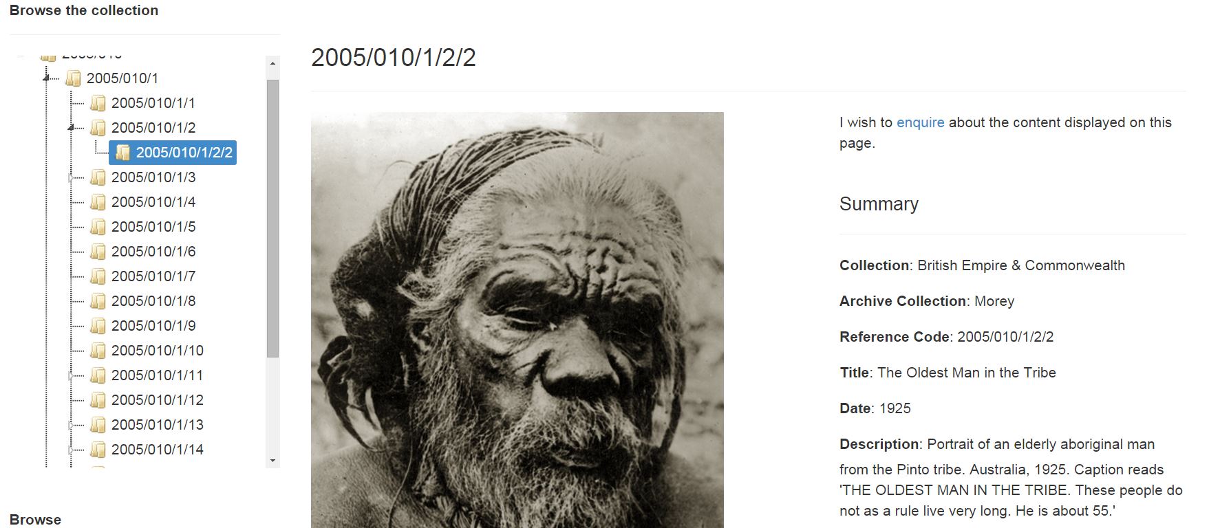
Here’s the result – using some css and the customisable features in jsTree we can indicate which is the selected record by highlighting. We also had to play around with the jsTree settings to enable the selected record to appear, by expanding each of its parent nodes in turn – to be honest it all got a bit loopy!

Capture

….here’s the link to this record on our Collections Online.

Hope this is of use to anyone going through similar issues – on the face of it the problem is a simple one, but as we are coming to learn in team digital – nothing is really ever just simple.


A week in the Bristol Museums digital team

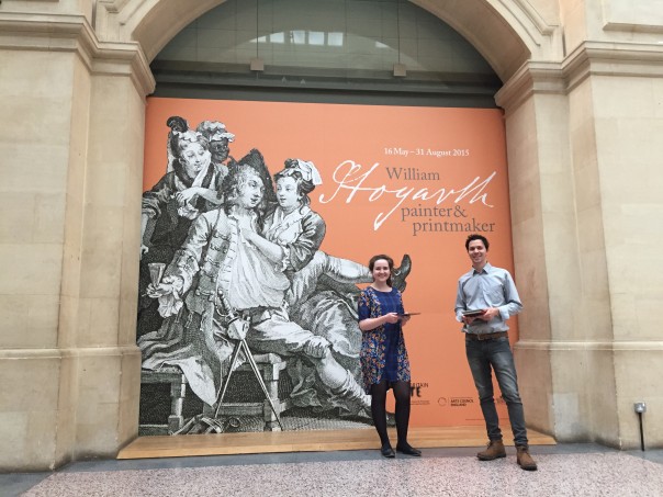
rachel-and-darrenHello! My name’s Rachel and I’m a Heritage Lottery Fund Skills for the Future graduate trainee. I am usually based in Worcester as part of the Worcestershire’s Treasures project, with my traineeship focused on audience development and events. As part of the traineeship I’m able to do a week’s secondary placement at another museum or heritage venue, and this week I joined the Bristol Museums digital team to get an insight into what they do, and generally learn some new stuff. I got in touch with Zak and Fay as I knew I wanted to spend my week elsewhere learning more about museums and digital. I had seen both of them speak at conferences – Zak at the Museums Association’s annual conference in Cardiff, and Fay at Culture 24’s Digital Change: Seizing The Opportunity Online in Birmingham – and thought Bristol seemed like the place to be for museums and digital!

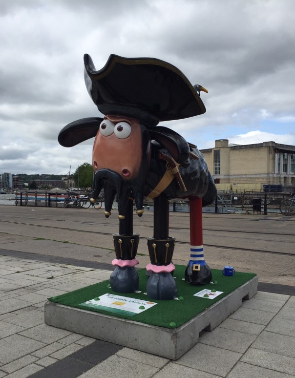
I’ve been involved with some really interesting and useful things since the start of the week. On Monday I did some content management on the development site in preparation for user testing later on in the week. On Tuesday I sat in on a meeting with fffunction, and then joined the museum’s new digital marketing intern, Olivia, in creating some content for social media. As the Shaun the Sheep trail started this week, we had fun coming up with some awful sheep-related puns – keep an eye out for these on @bristolmuseum! pirate_shaunOn Wednesday I visited The Georgian House Museum and The Red Lodge Museum, conducted some visitor surveys down at M Shed, and then yesterday I sat in on some user testing sessions with teachers, for the new learning pages of the website. They were given a number of scenarios to work through and it was really fascinating to see how users interact with the site and the different ways people navigate through it.
Some of the other useful things I’ve been introduced to this week are the organisation’s Audience Development Strategic Plan and their social media guidelines, and how data collected from users is collated and reported.  I also sat in on a meeting with some of the team involved with the upcoming exhibition death: the human experience to discuss the digital engagement to go alongside the physical exhibition and programme. This is just one example of the collaborative nature of the digital offer, and it came across to me that it is viewed as an integrative part of the exhibition, as opposed to just an add-on, which is really positive.

It’s also been great seeing how a different museum works. The museum I work at is quite different, in terms of size, staffing, collection and audience, and so coming to a large local authority museums service with seven physical sites has been a valuable experience in itself.

Overall I have had a brilliant week, I think it’s been a good overview of the team’s work, with lots of variety and things to get involved with. I have felt really welcome and included, and everyone at the museum has been so friendly. Thanks so much to the team for hosting me this week, and especially to Fay for letting me follow her round for most of it. My traineeship comes to an end shortly, so hopefully you’ll see me on a digital team soon!

bristolmuseums.org.uk – phase two, milestone three

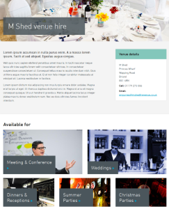
m_shed_venue_hireWe haven’t done an update on website phase two in a while, mainly because we’ve been busy bees behind the scenes with testing and implementing lots of new stuff.
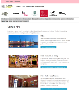
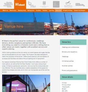
We’re now in the midst of milestone three, having done some work on improvements in milestone one and having held our milestone two workshops a little while back. We recently went live with some fresh new venue hire sections: http://www.bristolmuseums.org.uk/venue-hire/

After workshops and testing we decided to go down the route of event types for venue hire – we have lots of interesting conferences at M Shed, really exciting evening events at Bristol Museum & Art Gallery and lovely weddings at Blaise Castle House Museum so can adapt these depending on what people need and what our offer is. People can find information on room spaces such as capacities, download our menus and contact us to book really easily.

Know anyone who wants to hire a pretty special venue in Bristol? Send ‘em our way!

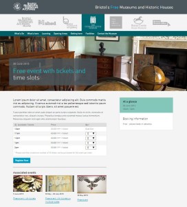
event_espresso_whats_on_190615Right now we’re in the middle of developing our ticketing functionality, which we’ll be using for our what’s on events (to replace third party sites such as eventbrite) and eventually for learning workshops. For this we’re using WordPress plugin Event Espresso; we’ve been really impressed with how this works and we’re pretty confident it’ll make the user experience so much nicer for people wanting to book with us. There’s a lot of work for us to do on fulfilment (we need to decide what to put on confirmation emails and tickets), setting up a new database and making sure people can navigate through registration easily.
Next up is user testing with teachers and learning people which will be at the beginning of July. We need to cover a number of things for learning: showing our offer (school workshops, gallery visits, teacher training etc), giving users the right information to be able to plan their visit (such as risk assessments) and then being able to book and take payments, so we’ll be testing all of this.

learning workshopsWe’re aiming for learning sections to be in place before the new school year and what’s on updates to be in place before our next What’s On guide comes out in September.
bristolmuseums.org.uk – phase two, milestone two

Well it seems it’s March already. This means we’re now two milestones into project website phase two.

We’ve done a chunk of work on events filtering, which you can try out here: http://www.bristolmuseums.org.uk/whats-on/ Hopefully you’ll agree it’s pretty simple and useful. Of course we did a spot of user testing for it and got lots of positive noises from people – let us know what you think of it.

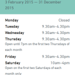
broWe also worked a bit on improving how our opening times are displayed. We added the option to add ‘notes’ to particular days, which is mainly for Bristol Record Office who have a range of opening times across any given week or month. We’re really trying to make it as clear as possible when our sites are open (and of course each of the six sites have different opening times across different seasons over any given year).
Other stuff for milestone one included nicer 404 pages, WordPress upgrade and some other bits and bobs from phase one.

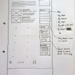
So, onto milestone two. During February we held three workshops – for venue hire, what’s on and learning. In these we got a load of people from all over the service together to map out who our users are and what they need from us for each. Ben over at fffunction is going to talk more about how we get from the workshops to the prototypes in a future post, but for now I’ll leave you with a couple of images to show where we are with our venue hire section. At the moment we’re testing the prototype and putting together some visual designs for it. I’m sure it won’t be long until it’s live, and in the meantime we’re starting to think about how we show our learning offer and enabling users to book workshops online.

visual
Visual designs for venue hire

prototype
Venue hire prototype


Websites coming out of the woodwork

Screenshot of the portcities websiteI’ve worked at Bristol Museums for just over two years now, and still now and then I’ll be chatting to someone or receive an email saying “oh, did you know that such and such website is ours?” Which I then add to my growing list and maybe have a little grumble to myself about.

Now, on the one hand, it’s great that people are telling us about these (anyone else want to let us know of any more, please?) but on the other it creates a bit of a headache for us in keeping track of exactly what content of ours is online and how people are using it.

It’s easy to just assume that, because they’re pretty old and incredibly out of date in some (most) cases, that they’ve been forgotten about and people don’t use them. This isn’t necessarily the case, though.

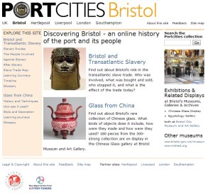
One example of this is the Portcities website – http://discoveringbristol.org.uk/ – which was made around 2003. It gets a huge amount of traffic – just over 470k unique pageviews in 2014, which is coming up for nearly half of the amount we get to our main website www.bristolmuseums.org.uk (around 1m a year and growing).

I looked at the analytics for this with Jane from our Learning team recently, and there are some other interesting things that we can see:

  • There’s a dip in traffic over the summer and during school holidays, suggesting it could be being used as a learning resource
  • Most of the content looked at is about Bristol and Transatlantic Slavery
  • The main bulk of visitors (around 45%) are from the US. This is nearly twice as many visits than we get from the UK
  • 86% of visitors find the website from search

There’s clearly a purpose for this content, so we need to think carefully about what we do with it. We’re working really closely with our Learning team to try to map this out, find the opportunities and see what we can do to best serve these users.

bristolmuseums.org.uk – Phase Two Planning

We’re now starting work on phase two of our website, www.bristolmuseums.org.uk, as Zak has already mentioned. So here’s a bit more detail about what we’re planning, once again following the GDS phases of service design.

(Note: if you’d like to read about what we did for phase one, you’re in luck – we’ve lots of posts about it on this here blog.)

We’ll be working with the guys over at fffunction in three stages over the next three months. From an evaluation of user needs and developing on from phase one, we’re going to be focusing on things that generate revenue and make it easier for people to book with us; whether that’s improvements to the what’s on sections (which get the majority of visits), learning and venue hire.

Milestone 1 – January 2015

Updates and work carrying on from phase one on opening times, events filtering, navigation and what’s on sections.

Milestone 2 – February 2015

Workshops with the programming, learning and venue hire teams to really get to grips with what our users need from us online in these areas.

Milestone 3 – March 2015

Workshopping and implementing a ticketing solution for the above, making our online shop look a bit nicer and researching and implementing online donation functionality.

We’ll keep you posted with how it’s going and what we discover.