There are various versions of a common saying that ‘if you don’t measure it you can’t manage it’. See Zak Mensah’s (Head of Transformation at Bristol Culture) tweet below. As we’ll explain below we’re doing a good job of collecting a significant amount of Key Performance Indicator data; however, there remain areas of our service that don’t have KPIs and are not being ‘inspected’ (which usually means they’re not being celebrated). This blog is about our recent sprint to improve how we do KPI data collection and reporting.

The most public face of Bristol Culture is the five museums we run (including Bristol Museum & Art Gallery and M Shed), but the service is much more than its museums. Our teams include, among others; the arts and events team (who are responsible the annual Harbour Festival as well as the Cultural Investment Programme which funds over 100 local arts and cultural organisations in Bristol); Bristol Archives; the Modern Records Office; Bristol Film Office and the Bristol Regional Environmental Recording Centre who are responsible for wildlife and geological data for the region.
Like most organisations we have KPIs and other performance data that we need to collect every year in order to meet funding requirements e.g. the ACE NPO Annual Return. We also collect lots of performance data which goes beyond this, but we don’t necessarily have a joined up picture of how each team is performing and how we are performing as a whole service.
Why KPIs?
The first thing to say is that they’re not a cynical tool to catch out teams for poor performance. The operative word in KPI is ‘indicator’; the data should be a litmus test of overall performance. The second thing is that KPIs should not be viewed in a vacuum. They make sense only in a given context; typically comparing KPIs month by month, quarter by quarter, etc. to track growth or to look for patterns over time such as busy periods.
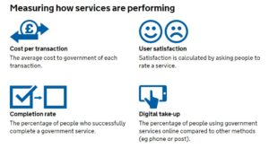
A great resource we’ve been using for a few years is the Service Manual produced by the Government Digital Service (GDS) https://www.gov.uk/service-manual. They provide really focused advice on performance data. Under the heading ‘what to measure’, the service manual specifies four mandatory metrics to understand how a service is performing:
- cost per transaction– how much it costs … each time someone completes the task your service provides
- user satisfaction– what percentage of users are satisfied with their experience of using your service
- completion rate– what percentage of transactions users successfully complete
- digital take-up– what percentage of users choose … digital services to complete their task
 Added to this, the service manual advises that:
You must collect data for the 4 mandatory key performance indicators (KPIs), but you’ll also need your own KPIs to fully understand whether your service is working for users and communicate its performance to your organisation.
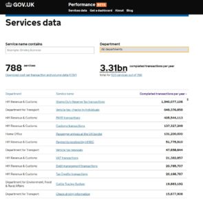
Up until this week we were collecting the data for the mandatory KPIs but they have been somewhat buried in very large excel spreadsheets or in different locations. For example our satisfaction data lives on a surveymonkey dashboard. Of course, spreadsheets have their place, but to get more of our colleagues in the service taking an interest in our KPI data we need to present it in a way they can understand more intuitively. Again, not wanting to reinvent the wheel, we turned to the GDS to see what they were doing. The service dashboard they publish online has two headline KPI figures followed below with a list of the departments which you can click into to see KPIs at a department level.
Achieving a new KPI dashboard
As a general rule, we prefer to use open source and openly available tools to do our work, and this means not being locked into any single product. This also allows us to be more modular in our approach to data, giving us the ability to switch tools or upgrade various elements without affecting the whole system. When it comes to analysing data across platforms, the challenge is how to get the data from the point of data capture to the analysis and presentation tech – and when to automate vs doing manual data manipulations. Having spent the last year shifting away from using Excel as a data store and moving our main KPIs to an online database, we now have a system which can integrate with Google Sheets in various ways to extract and aggregate the raw data into meaningful metrics. Here’s a quick summary of the various integrations involved:
Data capture from staff using online forms: Staff across the service are required to log performance data, at their desks, and on the move via tablets over wifi. Our online performance data system provides customised data entry forms for specific figures such as exhibition visits. These forms also capture metadata around the figures such as who logged the figure and any comments about it – this is useful when we come to test and inspect any anomalies. We’ve also overcome the risk of saving raw data in spreadsheets, and the bottleneck often caused when two people need to log data at the same time on the same spreadsheet.
Data capture directly from visitors: A while back we moved to online, self-completed visitor surveys using SurveyMonkey and these prompt visitors to rate their satisfaction. We wanted the daily % of satisfied feedback entries to make its way to our dashboard, and to be aggregated (both combined with data across sites and then condensed into a single representative figure). This proved subtly challenging and had the whole team scratching our heads at various points thinking about whether an average of averages actually meant something, and furthermore how this could be filtered by a date range, if at all.
Google Analytics: Quietly ticking away in the background of all our websites.
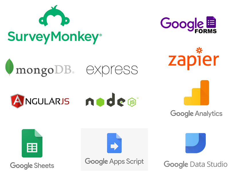
Google sheets as a place to join and validate data: It is a piece of cake to suck up data from Google Sheets into Data Studio, provided it’s in the right format. We needed to use a few tricks to bring data into Google Sheets, however, including Zapier, Google Apps Script, and sheets Add-ons.
Zapier: gives us the power to integrate visitor satisfaction from SurveyMonkey into Google Sheets.
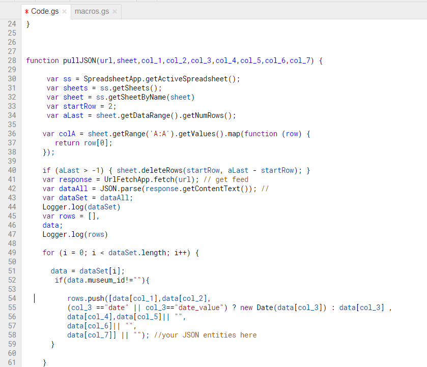
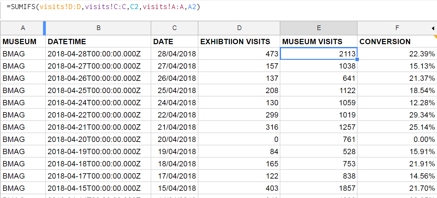
Google apps script: We use this to query the API on our data platform and then perform some extra calculations such as working out conversion rates of exhibition visits vs museum visits. We also really like the record macro feature which we can use to automate any calculations after bringing in the data. Technically it is possible to push or pull data into Google Sheets – we opted for a pull because this gives us control via Google Sheets rather than waiting for a scheduled push from the data server.
Google Sheets formulae: We can join museum visits and exhibition visits in one sheet by using the SUMIFS function, and then use this to work out a daily conversion rate. This can then be aggregated in Data Studio to get an overall conversion rate, filtered by date.
Sheets Add-Ons: We found a nifty add-on for integrating sheets with Google Analytics. Whilst it’s fairly simple to connect Analytics to Data Studio, we wanted to combine the stats across our various websites, and so we needed a preliminary data ‘munging’ stage first.
Joining the dots…
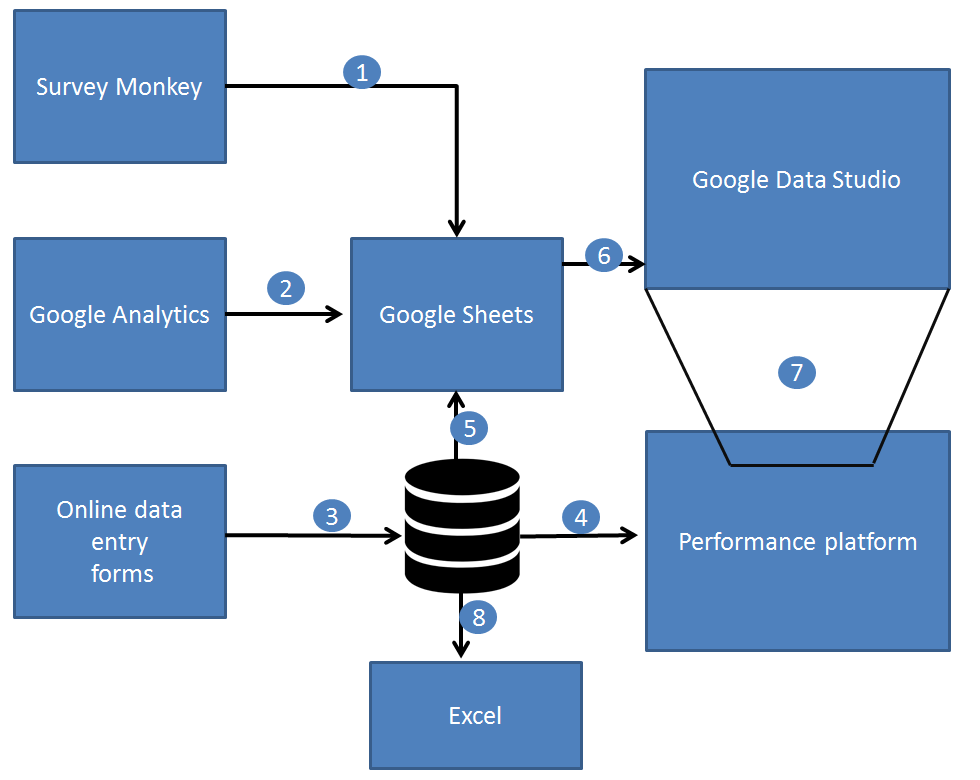
1.) Zapier pushes the satisfaction score from SurveyMonkey to Sheets.
2.) A Google Sheets Add On pulls in Google Analytics data into Sheets, combining figures across many websites in one place.
3.) Online data forms save data directly to a web database (MongoDB).
4.) The performance platform displays raw and aggregated data to staff using ChartJS.
5.) Google Apps Script pulls in performance data to Google Sheets.
6.) Gooogle Data Studio brings in data from Google Sheets, and provides both aggregation and calculated fields.
7.) The dashboard can be embedded back into other websites including our performance platform via an iframe.
8.) Good old Excel and some VBA programming can harness data from the performance platform.
Data Studio
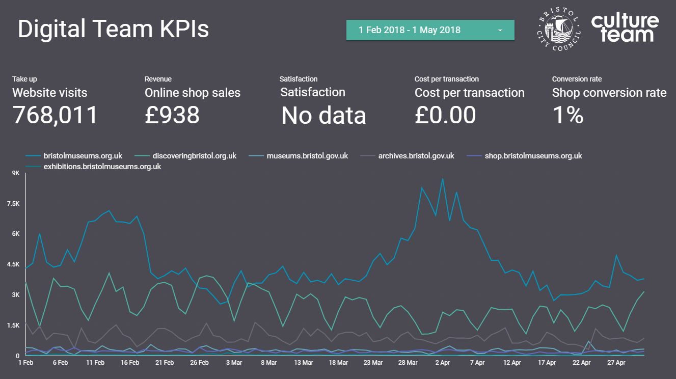
We’ve been testing out Google Data Studio over the last few months to get a feel for how it might work for us. It’s definitely the cleanest way to visualise our KPIs, even if what’s going on behind the scenes isn’t quite as simple as it looks on the outside.
There are a number of integrations for Data Studio, including lots of third party ones, but so far we’ve found Google’s own Sheets and Analytics integrations cover us for everything we need. Within Data Studio you’re somewhat limited to what you can do in terms of manipulating or ‘munging’ the data (there’s been a lot of munging talk this week), and we’re finding the balance between how much we want Sheets to do and how much we want Data Studio to do.
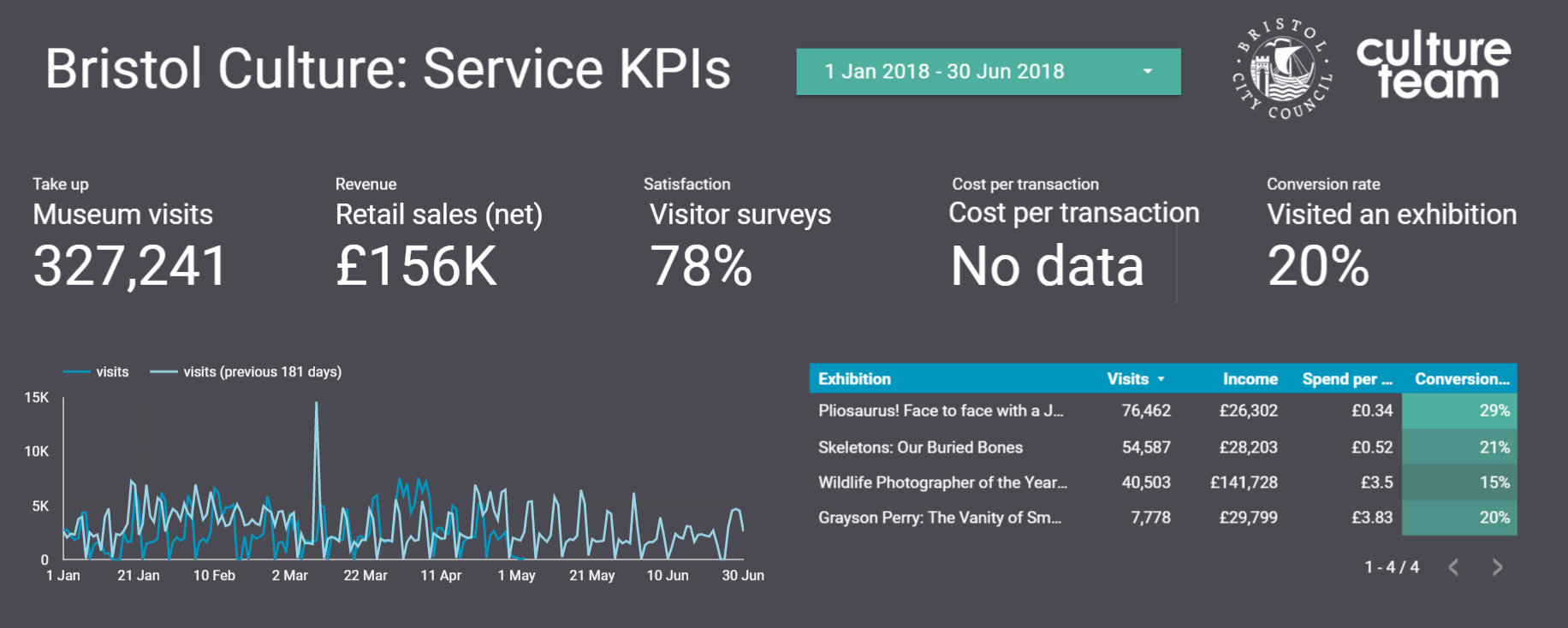
At the beginning of the sprint we set about looking at Bristol Culture’s structure and listing five KPIs each for 1.) the service as a whole; 2.) the 3 ‘departments’ (Collections, Engagement and Transformation) and 3.) each team underneath them. We then listed what the data for each of the KPIs for each team would be. Our five KPIs are:
- Take up
- Revenue
- Satisfaction
- Cost per transaction
- Conversion rate
Each team won’t necessarily have all five KPIs but actually the data we already collect covers most of these for all teams.
Using this structure we can then create a Data Studio report for each team, department and the service as a whole. So far we’ve cracked the service-wide dashboard and have made a start on department and team-level dashboards, which *should* mean we can roll out in a more seamless way. Although those could be famous last words, couldn’t they?
Any questions, let us know.
Darren Roberts (User Researcher), Mark Pajak (Head of Digital) & Fay Curtis (User Researcher)
