At Bristol Museums we use EMu to manage digital interpretation, and have several galleries with touchscreen kiosks displaying object narratives. We haven’t yet settled on a single technology, framework or data model as each new project gives us opportunities to test out new ideas, based on what our audiences want and on our previous learning. The refurbishment of our European Old Masters Gallery has given us the opportunity to extend the printed interpretation into digital.
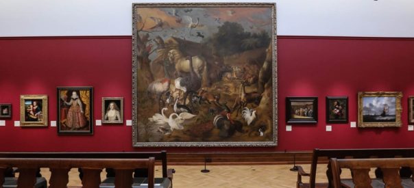
The classic look of the gallery means label space is kept to a minimum, and this had reduced the amount of printed interpretation available on the physical labels. Digital gives our curators the opportunity to expand on the depth of interpretation by writing more detailed descriptions of paintings. Our challenge was to come up with a solution that provided in-gallery mobile digital interpretation that was easy to access and fast to load, and that made sense in context.
Taking a user-focused approach, we were keen to provide appropriate technology to the sorts of visitors to the gallery. Our audience research shows that mobile technology is a standard anong these visitors, as explained by Darren Roberts, our user researcher.
Our Audience segmentation shows that three of the Core Audience Segments for Rembrandt – City Sophisticates, Career Climbers, and Students – are all over 20% more likely than average visitors to use their mobile phone to access educational web content or apps. All three groups are also over 20% more likely than average to agree with the statement ‘I couldn’t live without the internet on my mobile’. These three segments account for over a third of the general audience for the museum.
Ranked in order of segments that are both most likely to have an interest in Antiques and Fine Art and use their mobile phone to access free educational content or apps:
-
Student Life
-
Lavish Lifestyles
-
City Sophisticates
-
Career Climbers
-
Executive Wealth
The top three are over 40% more likely than average visitors to engage in both these activities. All five are expected to be part of the core audience for the Rembrandt exhibition.
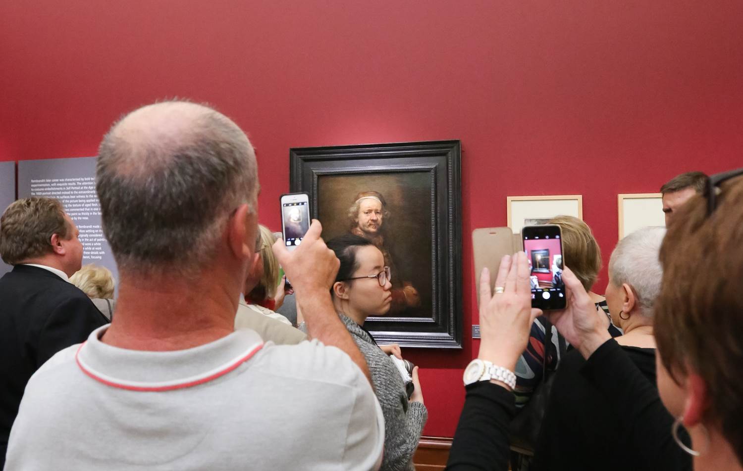
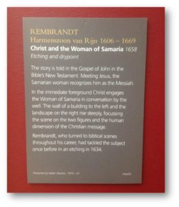
With this in mind, we set about analysing the printed labels – looking at where data could be brought in from our collections management system (EMu) automatically to minimise effort in writing content. As it turns out we already had most of this data (artist name, birth date, death date etc.) and so the main curatorial effort could be focused on text wiring for the labels, while we designed the template to bring the data together.
Thanks to some preliminary experiments, we already had a working framework to use – we are using AngularJS on the client side for rapid prototyping, templating, routing and deployment.
Our next challenge was to optimise performance and maximise up-time. Having been inspired by the linked open data movement, we opted for having the data sit in structured JSON files that could be reused multiple times by various apps without querying the database directly. This had the double effect of reliability and speed. We did a similar thing with multimedia, running a regular content refresh cycle and packing everything up for the app to use, with images saved at sizes for thumbnail and detail views.
The finished template was as follows – we opted for a minimalist design for east of reading, and with responsive elements the pages work across multiple devices.
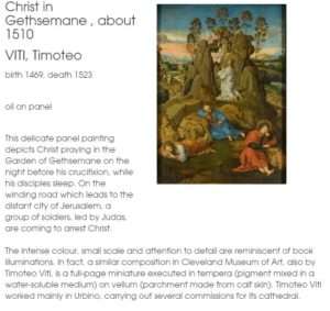
The process of selecting source fields and mapping them to the template has inevitably thrown up areas where our database use could be improved, and where before we had data across many fields, now we have laid out better guidelines for object cataloguing that should ease this issue – for the app to work we needed set fields to extract information about the painting and artists.
We also had to deal with inconsistencies in terminology, for example the various ways dates could be written – on printed labels these variations are permitted, but we need to define the semantic patterns in order for this to work in digital. Now we have a workflow for improving the way we catalogue our objects as a result of this process.
Where some terms were abbreviated on the labels e.g “b” and”d” for birth and death – we expanded these on the digital labels as space was not an issue and we also felt this was easier for users to read and understand – digital allows us to implement some of our user focused principles without disrupting the printed gallery interpretation.
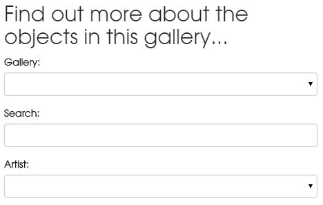
Through in-gallery user testing we found that whilst some features were obvious to us, visitors were not always getting to the bits we wanted them to see – we therefore added a call to action to make it clear what was available…
“Find out more about the objects in this gallery”
Something we are interested in finding out is how users navigate to their chosen painting. User stories and personas are one method we could use to get a better understanding of this. To facilitate various user journeys, we provide different routes to each digital label, either by searching by painting name, filtering on the artist’s name, or through browsing through the list view.
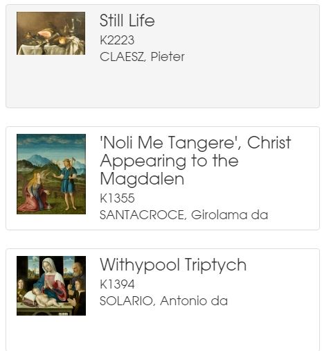
Technical details:
The routing mechanism of AngularJS gave us a simple way to navigate through from the list view to the record view by altering the # parameter as follows:
List view: museums.bristol.gov.uk/labels
Record view: museums.bristol.gov.uk/labels/#/id/14135/narcissus
We also included some libraries for smooth page loading to improve the user experience. At this stage we don’t know whether the digital labels have a use outside the gallery, but in case the do we wanted the pictures to be zoomable, and there was a code library that allows this. N.B. this is not yet deep zoomable, but we are on the road to achieving that.
Data stuff
We want to be able to reuse our structured data on paintings and artists and their info and dates whenever new technology comes along, and so our data layer exists independently of the application, and it also sits outside our database on a publicly accessible endpoint. If you want to use any of it, in JSON form you can take a look here:
We store lists of objects in separate index.json files here:
museums.bristol.gov.uk/labels/data
And for details info about an object you can load up records by their id here:
museums.bristol.gov.uk/labels/id
Structures and paths may change as we develop the system so apologies if these are not accessible at any point. We change bits in order to improve issues with loading time and reliability, but we aim to resolve this to a standard approach to our data layer with time.
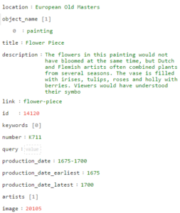
We are also figuring out what structure out object (json) records need to contain in order to maximise their use outside of our collection management system. Where dates and places exist in several source fields, we can prioritise these on export to choose which dates are most suitable, and similarly for places.
We construct a standard object schema in JSON as a result of a scheduled content refresh script which queries the IMu api, prioritises which fields to include the and saves as a JSON…
Next steps
We have implemented this in one gallery so far, and for one object type. We are now looking to roll this out to other galleries and look forward to similar challenges with different types of objects.
We are also extending the design of the prototype to bring in timelines and mapping functionality. These bring an interactive element to the experience and also provide new ways of visualising objects in time and space.
We included the TimelineJS3 library into our framework, and hooked it up to the same data powering the object labels. This provides a comparison of artists’ lives with each other, and with the paintings they produced.
We need to tweak the css a little, but out of the box it works well, thanks to the kind people at Knightlab.
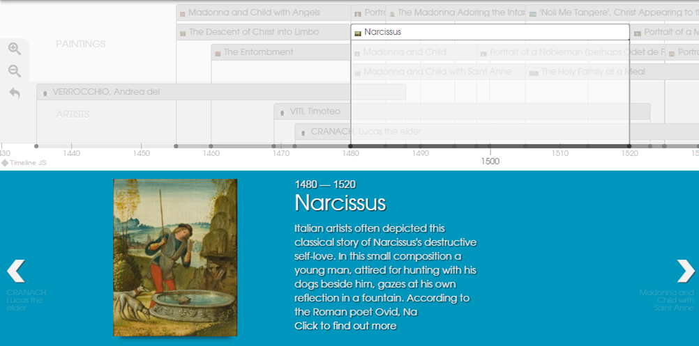
take a look at our alpha for the digital timeline here
Remarks
The project has made us rethink some of our cataloging standards – we are aligning our internal data capture and export to be better equipped to make use of new web tools for public engagement.
We have decoupled the tasks of writing label text, and reusing object data and applying narrative metadata. We also have a process that would allow new layers of interpretation to be written and published to the same application architecture, and we can present a simplified data entry process to staff for this label writing process.
Although we haven’t solved the problem of how to improve uptake of the application in-gallery, we’ll be ready when someone does. If its ibeacons that do it – and we think it might be, we can direct users to a single object label using a unique url to our digital label.
For now though it is just a trusty old url to point people to the page where they then navigate further, but we’d love to remove this barrier at some point.