Creating characters for our Hidden Museum app

We’ve been beavering away creating characters for our app. Creating a style for this exercised our grey matter somewhat!

We needed to create a look which complimented the very clean visual style that our lead designer for the project, Sarah Matthews created for the app. However, from our years of experience in creating characters for apps and games we know that younger children react much better to characters with an element of realism to them.

In user testing we trialed 3 potential styles:

A photographic style, using photographs of artifacts from around the museum:

Photographic character

A silhouetted style, which fits very well with the UI design, but is much less realistic in style:

Silhouette character

A geometric style, which is stylised like our UI design, but has much more realism:

Geometric character style

The overwhelming vote was for the geometric style, which thankfully our production team all liked too – so we decided to go down this route.

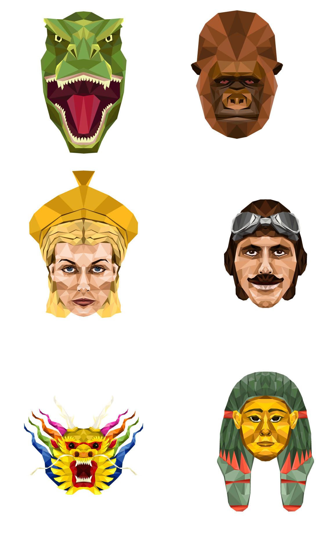
Next we had to decide what our characters should be – we had some ideas and Gail was great at helping us to hone these down. We wanted them to really represent the diversity of the exhibits at the museum, and also be appealing to all age groups and both males and females. So we settled on the ubiquitous dinosaur, George Peppard the boxkite pilot who flies the plane in the main hall, a chinese dragon head as represented in the chinese dragons over the stairs int he main hall, a roman goddess to represent the museum’s wealth of roman artifacts, a female Egyptian Mummy with gorgeous coloured paint and… Alfred the Gorilla (obviously!)

Here are the results!

All characters

Still a bit of work to do on the Mummy to make her a little more female, but more or less there.

bristolmuseums.org.uk – Phase Two Planning

We’re now starting work on phase two of our website, www.bristolmuseums.org.uk, as Zak has already mentioned. So here’s a bit more detail about what we’re planning, once again following the GDS phases of service design.

(Note: if you’d like to read about what we did for phase one, you’re in luck – we’ve lots of posts about it on this here blog.)

We’ll be working with the guys over at fffunction in three stages over the next three months. From an evaluation of user needs and developing on from phase one, we’re going to be focusing on things that generate revenue and make it easier for people to book with us; whether that’s improvements to the what’s on sections (which get the majority of visits), learning and venue hire.

Milestone 1 – January 2015

Updates and work carrying on from phase one on opening times, events filtering, navigation and what’s on sections.

Milestone 2 – February 2015

Workshops with the programming, learning and venue hire teams to really get to grips with what our users need from us online in these areas.

Milestone 3 – March 2015

Workshopping and implementing a ticketing solution for the above, making our online shop look a bit nicer and researching and implementing online donation functionality.

We’ll keep you posted with how it’s going and what we discover.

Testing the stories/tour – Kids in Museums User Testing Day

At it’s core, our Hidden Museum app takes users on a tour around the Bristol Museum, guiding them to places in the museum they might not ordinarily go, and revealing hidden information as they progress through the game.

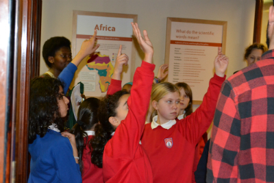
To simulate this experience our assistant creative director, Rich Thorne, behaved as the app, using one of the story-tours we had created; he did this by leading the group around the museum around a range of artifacts on a theme (in this case ‘horses’) and engaging them in conversation about each artifact as they went – explaining how they were linked and telling them an interesting story about each artifact once it was found.Kids on tour questions

The aim of this was to:

  • See how long it took them to get round the journey as a group.
  • Get feedback from the children on any standout points of interest on the tour.

Key observation points for the supervisors of the tour were:

  • Is the tour engaging, interesting?
  • Is the tour too long/short?
  • Which object was the favourite on the journey?
  • Have they visited the museum before?
  • Have they ever been to the top of the museum?
  • Is it more fun having a checklist? As opposed to walking around the museum looking at everything.
  • Do they have ideas for trail themes which would they like to go on?

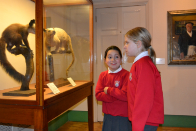
Kids in museums kids look at cabinet

What we found:

We discovered that the tours which we had devised contained too much identification in advance about what the group were going to see. For example, the horse trail said in advance that the group are going to find objects about horses in them. This was taking some of the excitement out of the tour. We needed to find a way to work on the themes in order to broaden them out to become more subjective and feel less curated.

We also learnt that this kind of curation meant that we were not making the most of the ‘hidden’ metaphor of our app. Whilst we were leading the group to areas they might not otherwise have gone to, it did not allow for enough free exploration of rooms and free thought around the objects themselves – getting lost in the museum and ‘accidentally’ discovering something hidden should be a desirable side effect of the app so we needed to find a way to allow for this.

The groups, particularly the kids, were very interested in collecting and counting. They were also particularly keen on emotive subjects – picking out items which were ‘weird’ or ‘strange’ or ‘scary’ or ‘cute’.

Kids in Museums – User Testing Day – Overview

On Friday 21st November, the Hidden Museum team were lucky enough to have the opportunity to be a part of a Kids in Museums take over day. Kids in Museums are an independent charity dedicated to making museums open and welcoming to all families, in particular those who haven’t visited before.

Kids in Museums Logo

This was a great opportunity for us to test our app in production with real users, over 30 kids and 6 adults who had never seen the app before! A real coup for us as developers – a chance to get some real insight into how our app might be received on completion.

However we were conscious that we did not want to take advantage of the day and it’s main aim of making museums more open to kids and families. So we took great care to plan the day with the education coordinators at the museum, Naif and Karen, to ensure that we were providing a fun experience for the kids, as well as testing elements of our app. As there were adults supervising the kids we also tested all elements with the supervising adults to get an impression of a family group’s opinion of each element (rather than kids opinions only) – very important as our app is aimed at a mixed-age group.

Kids on tour

Naif and Karen suggested that we warmed them up with a ‘fingertips explorers’ activity – where the kids felt an artifact blindfold, and had to describe it to their friends – their friend’s guessing what it could be. (A fun game which the kids really enjoyed and we have used as an influence for one of our games as a result!)

We decided that after the fingertips explorers warm up the kids would be ready for app testing!

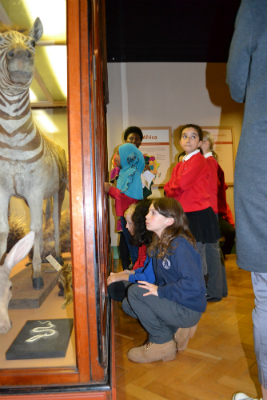
Kids in museums kids looking at zebra

As the app was not yet complete, we decided to test elements of the app broken down, rather than the experience as a whole. We decided to break our testing down into 4 elements:

Testing the stories/tour

Testing the iBeacons/compass interface

Testing the UI

Testing the games

This decision was reached mainly through necessity since the app was not complete. However, we found that it really worked for us, and allowed us to get some really in depth insight into our app. This was for two reasons – firstly it allowed us to break the group of children down into smaller more manageable groups so we were able to have real conversations with each of the children in turn – and secondly it allowed us to assess which elements of the app they struggled with the most and so exactly where we should be making our improvements.

There were lots of great testing outcomes to the day around each of the app elements outlined above – I’ll update the blog with how we tested each of the app elements (and the associated learnings) over the coming days.


Starting website phase two

In 2014 we launched www.bristolmuseums.org.uk in what we imaginatively called ‘phase one’ which not only gave us a service wide presence but allowed us to:

  • Follow the GDS service delivery approach for the first time – discovery, alpha, beta to live
  • identify real user needs through a discovery phase
  • plan to make the website a platform to help us delivery services for years to come
  • share publicly through a conference, blog, workshops and other events everything about the project
  • Keep my job – i half joke that i’d have quit if I wasn’t able to get the project done

We learned lots from doing this project and have done amazingly well with our key performance indicators.

With more than six months data under our belts as well as a ratified new service structure and direction for 2015-18 we are turning to starting phase two. Fay Curtis will be leading this project between January and April 2015. Check back regularly for updates.

Moved by Conflict exhibition Character Points

Zahid Jaffer, Content Designer

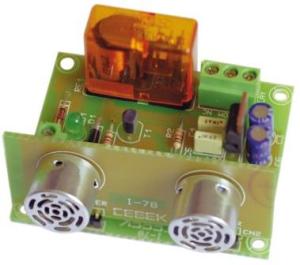
Image of an ultra sonic sonsor
Ultra sonic sensor

Overview

The Moved by Conflict exhibition at M Shed is comprised of many different types of technology to interpret content, from projectors to speakers.  We used some new technology we haven’t used in the past to deliver this content, notably the RFID tag system.

We had several briefs, but the one that stands out is: visitors need to have a personalised experience through the exhibition; the ability for visitors to have content of their choice delivered to them in the exhibition through digital means. The idea was to have stories being told through video, and we worked with Bristol Old Vic to bring a more theatrical performance to these stories.  We had actors playing six fictional characters telling their stories, which would capture their lives before, throughout and the end of the First World War.

Concept 

We needed a way for visitors to trigger the content when they wanted to experience it. Initially we wanted hidden video screens (projections) around the exhibition and when a visitor walked next to it the video magically appears for them. To do this we looked into iBeacons, a Bluetooth technology which can be used to trigger an activity from a specified distance to the user, for example playing a sound when someone gets within two metres of a loudspeaker. Our concept was when someone gets to within a metre of a screen the content appears and when they leave that area the content turns off. The trigger device would be a visitor’s smartphone or a small Bluetooth transmitter/tag.

Image of a media player
Media player

After a lot of research we found that this would cost a lot of money and would take a lot of time to develop – this technology is still very new, which is why it costs quite a bit. We looked then at long-range RFID technology, but this was also outside of our budget.  We decided to go for short-range RFID, so a visitor would need to pick up an RFID wrist band and scan it in a specific location, as we were still keen on the idea of the content being triggered when you get to a certain distance.  To do this we’d need to use a sensor, which wouldn’t trigger the main content but would trigger an intermediate screen, such as an image with instructions on it informing  you what to do with the RFID wrist band.

Once we had finalised the concept we started looking into the equipment that would enable us to do what we wanted. We looked at a number of options, ultimately what we went for worked very well.  The content is displayed on a 24 inch screen, used in portrait orientation. There is an actor speaking to camera, with their head and shoulders in shot, giving the actor lifelike dimensions.  We needed something that would play the content and to be able to accept triggers so we looked in to Raspberry Pi. For what we wanted to do there would be a lot of programming and coding, and we were also not sure if the Raspberry Pi would be instant enough on the triggering as we were informed  Raspberry Pi could have a slight delay in triggering hd content.  We wanted instant triggering and relatively easy setup/programming as we were limited on time, so we went down the route of a media player.

We selected a Brightsign hd1020 media player which has GPIO and allows you to connect buttons to trigger content, and also has USB input so you can connect a keyboard to it. The programming of this media player is relatively easy to do as it has graphical programming software you load on to your pc. These three elements were what we needed to make our concept work.

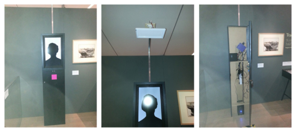
photos of the Character point (left), directional speaker (middle) and inside the character point (right)
Character point (left), directional speaker (middle) and inside the character point (right)

Concept to Reality 

The GPIO is connected to an ultrasonic sensor, which sends out a high pitched audio noise (well above human hearing) and listens for the echo to return. The sensor allows you to increase or decrease the sensitivity, meaning you can set the distance of how far you want it to trigger. It also has a ‘stay open state’ and ‘stay closed state’ feature, so when a person is watching the content the sensor will stay in an open state (as it is still detecting an object in front of it) and once the person steps out of the sensor’s range it will switch to a closed state and the content will finish.

The USB port on the media player is used to connect a USB close range RFID reader. This reader detects the RFID wrist bands that visitors pick up.  We’ve also used a directional speaker to limit sound spill in the gallery and to give the visitor a more personal experience.  With all these elements combined, the way it works is;

  1. On the screen the visitor sees a static attractor image
  2. As the visitor gets closer to the screen, the motion sensor will detect them
  3. This will trigger the content on the screen to change to an image with instructions asking them to scan their RFID wrist bands on the pink square (the RFID reader is directly behind the pink square)
  4. This will trigger the content.
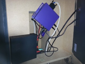
Photo of a Media player and audio amplifier
Media player and audio amplifier

If visitors read the instructions and decide they don’t want to view the content they can step away and the sensor will detect there is no one in front of it and switch to the attractor image. If a visitor decides to trigger the video content with the RFID wrist band and decides that they’d rather not watch any more, they can step away and the sensor will detect there is no one there, so the video will end and go back to the attractor image. In the exhibition we have six of these RFID interactives; we’ve named them Character Points.

Concept to Reality Issues

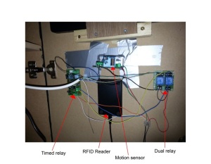
We quickly realised that there was an issue with the triggering. We found that the sensors were not staying in the open state; they would go into a closed state and open state repeatedly which meant the content wasn’t staying on the screen for long. To overcome this we bought a timed relay and wired it in to the sensor. The relay activates when the motion detector senses a person and holds the sensor in an open state – we set the time of this to 10 seconds. The relay gets activated even when it’s holding, meaning it will continuously reset the timer to 10 seconds as long as it’s detecting something. Now when a person steps away from the sensor’s range the content will stay on screen for 10 seconds then switch back to the attractor screen.

Photo of the internal components  of the character points
Internal components

Another issue we had was that some visitors decided to poke their fingers through the holes that the sensor’s microphones stick out of. These need to be visible otherwise the sensor will not work (you can see these microphones in the photo of the sensor above). The sensor would get dislodged and fall inside the character point. We tried using glue and silicone to stick these sensors to the door, but visitors still managed to push the sensor through. We found good old gaffer tape held the sensor in place and can withstand a lot of force if someone tries to push the sensor through.

Now that we have the equipment to do this kind of interactivity, we’ll be using it in other interactives. Hopefully in the future we can expand on this to make it in to a long-range RFID system.

Working in an agile manner

Our project will last 12 months and has three partners with multiple team members plus our funding partners team. As we’re all spread out across Bristol we need to lean heavily on a couple of solid web tools.

We’re working using Agile workflows, Brooklyn Museum recently wrote extensively about their process in Agile Baby Steps.  We work in two week ‘sprints’ starting and ending with a three hour face to face group meetings for the core team of about five.  During our two hiatus from each other we use Basecamp for keeping in touch  and Trello for assigning and reviewing tasks.

Why not use email I hear you ask? The problem with email is that you can’t easily share threads with entire teams and isolate the project communication quickly from all your other email (stick with your fancy email filtering if your a sucker for punishment!).  Basecamp works very well for remote communication as it is designed to take the best bits of email and apply them to teams. However I struggle with using Basecamp to stay on top of the task management part and this is where trello comes into play. We have a series of “lists” and use the same process for each sprint, enabling us to see where we are at any given time, who is assigned a task and which tasks are in a ‘done list’. We can then make our face to face meetings more productive as we just need to review trello. We expect doing this will make writing project documentation smoother too.

We have been lucky that two of the three partners were already using both these tools to make this easier. If you struggle with managing projects Basecamp and Trello (free) are worth looking at. Onwards to the next sprint.

Introducing The Hidden Museum project

We’re pleased to announce that alongside our partners Aardman and the University of Bristol, we have been successful in winning funding for a 12 month project called “The Hidden Museum” as part of the Digital R&D Fund for the Arts. Check back regularly to hear how the project is progressing.

This project will and test a museum multitool app that makes family and group visits to Bristol museums more fun and playful. The app will promote group interaction directly with the museum, its displays and hidden treasures. The focus is on improving visitor experience in museums and galleries and many of these cite engagement with families as a key goal. New location aware digital technologies such as iBeacons can be used to explore, improve and promote more effective visitor engagement and to encourage higher levels of intergenerational or group activity and learning.


Running Google Chrome in Kiosk Mode – Tips, Tricks and Workarounds

We are using Google Chrome to publish collections based information and multimedia to the galleries in M Shed using a web application. Here are a few pointers which have helped us get the system up and running

How to run chrome in kiosk mode?
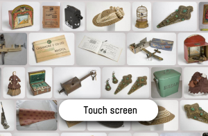
Kiosk screenshot

Google Chrome comes with a built in kiosk mode which makes it load up as a full screen browser and without the usual menu bars and features that would normally let you navigate away from or close down the app. There are various ways you can do this, all of which involve tagging on the –kiosk argument to the command that starts Chrome. N.B. don’t try this out this unless you can CRT-ALT-DEL out of it! The script below can be saved as a .bat file in windows, run from the command line, or the extra arguments can be inserted into the proprties of the Chrome icon used to load up the application.

The following batch script loads up chrome in kiosk mode at a specific page:

start “Chrome” chrome file:///C:/Kiosk2014/CaseLayout.htm?KIOSK=LB-DS-ICT02 –kiosk

So far so good, but there are lots of reasons why this alone is not sufficient for the gallery environment. Here are some problems you may run in to, and the workarounds we have found….

1.) Chrome comes with an array of shortcut key combinations that let you access its hidden features, such as the chrome task manager (shift + ESC) and downloads (Crt + J). This means that if your gallery pcs have keyboards then users may be able to hack their way out of chrome and into the PC or off into the web (why a gallery keyboard would have shift and escape keys is beyond me, but ours do). To prevent this problem needs a minimal amount of JavaScript to catch the key press events and convert them to nothing before they are passed to the browser for interpretation. Here’s what is working for us right now:

$(document).keydown(function(e){ //when any key is pressed

if(e.keyCode == 27||e.keyCode ==18) { // if the key is CTRL or ALT

e.preventDefault(); } }); // do nothing

2.) How to run a website saved on the local file system? By default Chrome wont access scripts in files held locally (although Firefox will). Our kiosk applications are all held locally on each machine as a safety precaution in case of network downtime. To overcome the default behaviour in Chrome add the following argument to the startup command above

–allow-file-access-from-files

So the command we now have is:

start “Chrome” chrome file:///C:/Kiosk2014/CaseLayout.htm?KIOSK=LB-DS-ICT02 –kiosk –allow-file-access-from-files

3.) When the machine is rebooted or you force quit chrome, it restarts with the message “Chrome didn’t’ shut down correctly” in a yellow bar at the top of the screen which must be manually closed. This is unsightly for users and likely to be a common occurrence in the gallery environment. To overcome this we pass another parameter to the start command which causes Chrome to start in incognito mode and prevents the message. So our command is now this:

start “Chrome” chrome file:///C:/Kiosk2014/CaseLayout.htm?KIOSK=LB-DS-ICT02 –kiosk –allow-file-access-from-files –incognito

4.) When the web application crashes for whatever reason, there may be no way for a user to reload the page, or for the page to reload itself automatically. There are many different sorts of crashes that can occur, such as the ‘aw snap’ error where Chrome gives an unsmily face and a link to reload the page or navigate away off into the net. Since fixing some bugs and optimising our code we have not seen this error for a while, but we do have a method to return to the web app if something goes wrong. One method is to use windows task scheduler to close and reopen the web app after a set period of time, and handily we already have most of the code for this in the above command. We set the task to be triggered when the computer is idle for 5 minutes, and make the task run the following code – which kills any running chrome process and restarts the app at the right page:

@echo off

taskkill /F /IM chrome.exe /T

start “Chrome” chrome file:///C:/Kiosk2014/CaseLayout.htm?KIOSK=LB-DS-ICT02 –kiosk –allow-file-access-from-files –incognito

Incidentally this is the exact same script we have in our start up folder so that whenever the computer is rebooted, the application starts.

5.) Despite the above, we were still suffering from a ‘grey screen of death’ every once in a while, which loaded the background page in the right colour, but failed to load anything else. This was probably due to the complexity of the application and its various plugins, but it was very undesirable and almost impossible to replicate in our development environment. What was clear was that when the grey screen happened, none of the JavaScript files for the app had been loaded, rendering it useless and stuck. The workaround we have used for this was to bind an onClick event to the document body which forces a page reload, and to remove this event using JavaScript. This means that if the script files fail to load, the page will reload when someone touches it, and chances are everything will be ok, and if everything is ok – the reload click event is removed and the application functions normally.

So, at the top of the document we have this:

<body onClick=”location.reload()”>

and right before the closing body tag we have this:

<script type=”text/javascript”> $(function() { setTimeout(function () { if($(“#VisitorStoriesHelpText”).length>0){ $(‘body’).attr(“onClick”,””) } }, 1 * 1 * 1000);}); </script>

…..actually we haven’t seen the grey screen of death for a while, but a least it is no longer a show stopper.

So in conclusion – Google Chrome can be run in full screen mode as a gallery kiosk application, but it is not plain sailing, and in the gallery environment expect to see strange things happening. We are not out of the woods yet, and the legacy hardware keeps us on our toes, but at least in terms of the web application we can overcome many of the issues that this solution has presented us with.


*UPDATE*

We have seen on a number of machines some strange artefacts, pixellation and tearing occurring – when coloured spekles appear, or portions of black screen, in some cases the whole machine becomed unresponsive.  This only happens in the live environment and may be something to do with chrome kiosk mode vs windows 7. To solve this I have added another flag to the chrome command – –disable-gpu. With this added the pixellation goes away, it returns when the flag is removed. Time will tell if this solution holds water, or if it puts too much load on the cpu. We still have room for optimisation (using chrome dev tools) so we should be able to reduce the load if problems persist.