Video Subtitling – making content more accessible

We aim  to make the museum more accessible for all visitors and adding subtitles goes a long way to help us achieve this. For example see the video below, of the audio description DiscoveryPens, in use in the French Art Gallery, at their launch event.

DiscoveryPENS launch – at Bristol Museum and Art Gallery

I realised that our museum videos too, can and should be made more accessible! – and I don’t just mean spreading all over the world web – but for all our visitors of our website!
Our aim: to increase the accessibility of a video’s content -by using subtitles for all video and audio content.

The simple task of subtitling.
I’ll tell you now: It isn’t too difficult, but it can be considered a monotonous task. I have detailed what I did, with some advice how you can do this effectively. So bear in mind, that in my personal experience and if you have found a better way then let me know:

About 1min of video = 1hour of transcribing

Therefore, before you start, you can estimate how long it will take to subtitle your video. It does depend how long your video is, and how much of it is dialogue! Essentially it is a small thing to do, to advance the accessibility of your video content.

What I did:
• Watched the video and listened to the person talking.
• Paused the video and wrote down the speech in a document.
-this is for record keeping and to make sure there will be no spelling and grammar mistakes! When I copied this to subtitling my video on Youtube.
• I needed to make the subtitles match up to the visuals (usually the person speaking).
• But to have to enough time on screen to be read.

*Helpful tip: -to check if the timing was correct I would turn off the sound and see if I had enough time to read it.

• I would cut the dialogue to a sentence length which I thought looked well on the screen,
• fitted appropriately to the natural pause in the speech,
• and to not repel the editing cuts when the subtitles would change from sentence to sentence.

The cuts between shot to shot should be in accordance to the cuts between sentence to sentence.

Both words and visual cuts should appear smooth and not resisting each other.

• When the sentences were added to the video, in the appropriate place, I would record their start and end time.
• I would add this to the word document next to the deciphered speech.

*Helpful tip: To avoid your transcription document looking like a mass of unapproachable entries, I suggest separating the different parts of your video.

Written dialogue

• For example: Beginning, Middle, and End.
• Or of different people speaking if they are speaking in separate chunks.

This is usually where the video cuts, to a different part – your word document should try and reflect this.

• I also suggest doing this as you go! Your document will look a lot better and doing at the end will be a harder task.
Building the Pattern Library

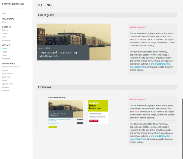
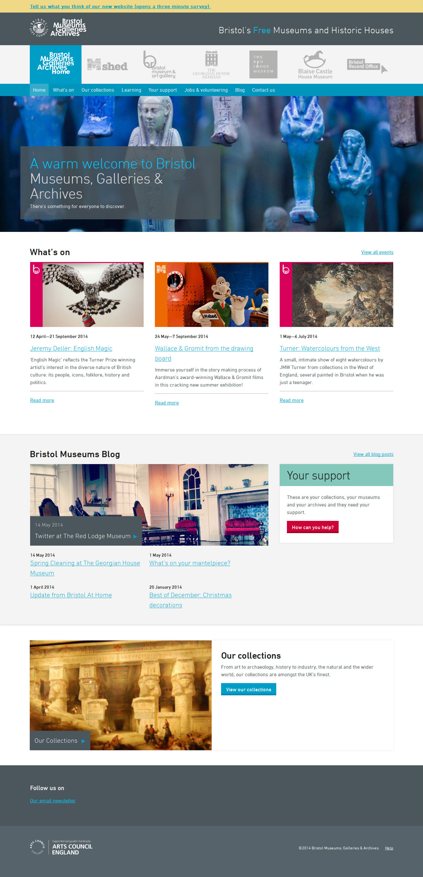
Something we’ve started in the last week or so is building out the BMAG pattern library.

guide-cut-ins

Eventually this will contain all the elements that will make up the website. We’ve already got some visual design going on, some core elements such as colour and typography and also wireframes in the form of screenshots from the prototyping work we’ve completed and tested.

We’ve broken the site into modules to work with to help with the BEMs orientated approach we’ll be building the site with. We’ve found it helps to start thinking in terms of modules rather than pages as early as possible in the design process in preparation for building using using BEMs.

For each of the modules we often have several variants, or different states that we have a clear definition for. We use different images for each state, and provide an explanation as to what can happen with each module.

So you can see in the left column of the pattern library that we’ve got the following groups:

Full Comps

Show full page visual designs, currently there’s a design for the homepage that is very much a work in progress.

Guide To

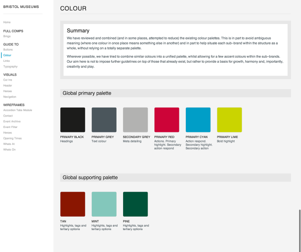
Shows core brand elements that are defined from the various venue brands and over-arching service brand. This includes: Buttons, Colour, Links & Typography. You can see an example of the colour page below:

guide-colour

Visuals

As visual designs come together we’re adding them here. Again, not too much to see aside from some initial thinking on some core elements.

Wireframes

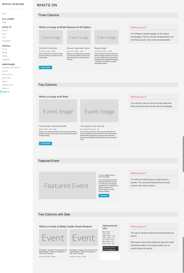
As we’ve been moving our thinking into the prototype and testing on users we’ve edited to improve the design. Once we’re happy with each module or group of elements we’re moving it into this pattern library for reference. You can see an example of the Whats On modules below:

guide-whats-on

Sketching museum home layout opening times

Let’s talk about the big little details that offered up some challenges. Basic information such as opening times are extremely valuable for visitors, despite being sometimes overlooked during the design process.

For our project, a common user journey would involve looking for something to do today, as the previous user research suggested. Visitors would like to know right away if the museum is open today and what activities or events are available.

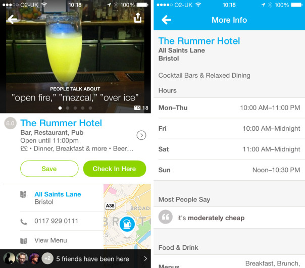
Foursquare venue opening times
Foursquare displays a time for the current day. A simple click links to a page with the full opening times.

A simple click or tap links to a page with the full opening times. This task gets more complicated when all our venues have a different system of timetables. They would all be displayed on the homepage of each venue but vary wildly in their arrangement. Who would have thought it could be such a challenge?

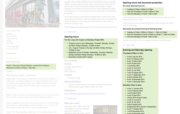
Venue times screenshot
Opening times for three of the museums involved in the project.

After some experimentation with the layout, we defined all of the user scenarios to solve. Some of the scenarios we found were, how do we show today’s time left before closing?  How do all the modules connect together if the venue is closed for a few months? How do we deal with irregular times without displaying a list full of exceptions and difficult to digest information on the homepage?


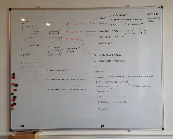
Venue homepage content
The tree of possibilities we have to think about to develop a flexible solution.

Looking at all the scenarios started sketching out different layouts to solve each.

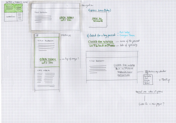
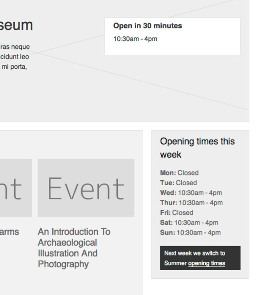
Today time on hero
A few ideas to display today’s opening time for each case.
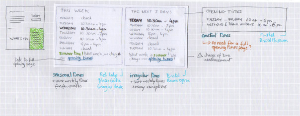
Weekly opening times
Sketches about displaying a weekly opening timetable: some venues have very regular times throughout the year, other requires flexibility.

And once we’d sketched out and refined all the options we could display we moved all the ideas into a prototype.

Prototype implementation
One of the cases implemented in the prototype.

Check out the rest by clicking on each venue on http://bmga-prototype.fffixture.co. We’ll be testing this with users next week to validate our thinking and see which ideas perform best.


Developing the UI with Sketching

Something we’re massively keen on is sketching. Its the quickest way to get ideas out of my head and onto a page, and whilst I’m doing it I’m debating and justifying the decisions I make along the way. Its an incredibly good exercise for honing ideas quickly.

So today I began sketching UI ideas for the various sections of the site, having first digested the IA and User Research work we’ve completed.

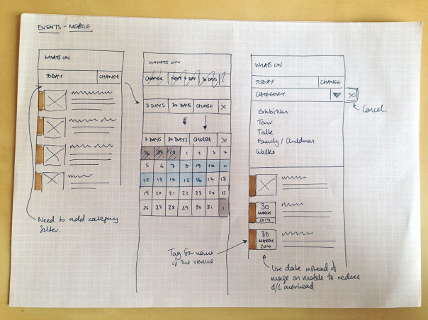
The images below show the sketching I’ve been doing  whilst looking at the different display options for handling events. We need to give the user an initial snapshot of the day’s events, whilst enabling them to look at a week, a month or a custom time period. We also want to offer them the option to filter by type of event, or the venue.

So in this first image  I’m looking at a mobile view, and how users can interact to view the events as they wish. There’s ideas coming out such as colour coding events by venue. I also started with thumbnail images for each event, and then thought about download overhead, and so made a note that we could use a date card device there instead.

Events---Mobile

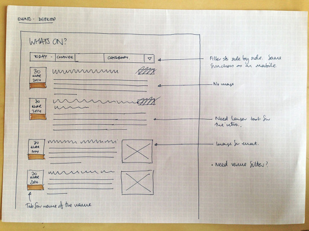
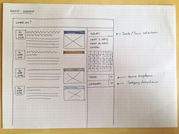
The next step was to take the ideas to the desktop view, and see how we could configure and add to them there. So there’s two ideas on how to treat the elements from the mobile view. You can see I’m exploring the options for displaying the filter – whether in a horizontal configuration that closely resembles the mobile UI, or in a sidebar so its very visible for the user. I’ve considered whether there will be images for each event, and what to do if there is not one. And lastly, how to use the colour coded tabs to indicate the venue for each event.

Events---Desktop-1

Events---Desktop-2

All a work in progress, but worth sharing so you can see how I quickly generate, discard and progress ideas. The next step for us is to test these ideas with users, and see how they respond.

Building a prototype and user testing

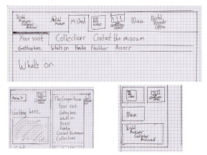
Since our initial review of user research, I’ve been busy developing information architecture and navigation ideas. We’ve worked up an initial information architecture and navigation which is geared towards getting museum visitors the information that they need but which will allow the site to expand to accommodate content for other users in later phases of the project.

Sketches for navigation for mobile and desktop views of the Bristol Museums website

We’re committed to testing our work with users throughout the project and for these early stages we’ll be using an interactive prototype built with HTML and CSS for this. Building and testing with a prototype in this way allows us to

  • work quickly and iteratively
  • experiment, keeping what works and throwing away what doesn’t
  • design and test across devices: everything we build must be fully responsive
  • quickly, easily and continuously share our designs with members of the team, stakeholders and everyone else who is interested (see the URL below)

More details of how we build our prototypes will come in a later post or, in case we forget(!), on request.

We’re working on setting up a development site to publish the prototype on Bristol Museum’s hosting but until that’s sorted, you can access it here:

http://bmga-prototype.fffixture.co

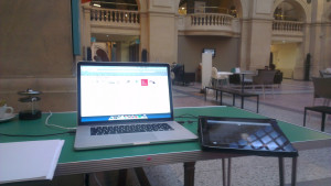
Last week we ran the first tests with members of the public. We set ourselves up with a laptop and an iPad in the cafe at Bristol Museum and Art Gallery and invited users to test the IA and navigation. Volunteers who could spare us 10 – 15 minutes were asked to complete a theoretical task by navigating the prototype whilst talking through what they were thinking and doing.

User testing at Bristol Museum with a laptop and an iPad
User testing at Bristol Museum with a laptop an iPad and a pot of tea

We tested with a number of individuals or couples and gained some really helpful insights into our early stage designs. We’re incorporating changes to the navigation as a response to these insights at the same time as starting to populate the prototype with features and content for further user testing.

Raspberry Pi as aTouchscreen Kiosk

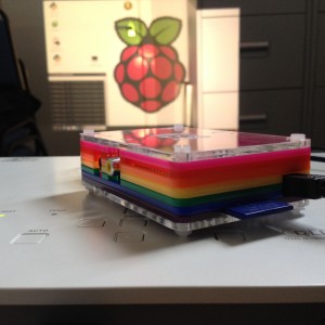
I am currently downloading a web application onto a Rasperry Pi in the hope that it will work. The idea is to use dropbox to sync a web directory when the device loads up which will then be accessed by a touchscreen interface. All files are held and referenced locally so if the internet goes down there is no downtime for people in the gallery.

pi

The system is up and running already on a Mini-mac, and working well. Our problem is that only one Mini-mac in the gallery has an operating system that can run a modern browser such as chrome, which is needed to run the gallery app.

The main test is if the Chromium web browser on the Pi behaves in the same way as Chrome on the mac – if this fails we will need to rethink things – perhaps the javascript could be tweaked to make it work, but maintaining two versions of the app would be rather time consuming.

If and once the app works – the test will be one of perfomance and whether any css effects run too slow to make this a feasable replacement for the Mini-macs.*

* this blog post comes mid way through the project so some background information is needed: we are in the process of migrating a gallery interactive solution from a stand alone system into the main collections database. In doing so we are redeveloping the legacy flash-based applications into a more sustainable javascript web application. During the project it has become clear that new hardware is required in order to run modern web browsers, and the budget implications of replacing 14 mini-macs has got us experimentinf with the Pi.

Watch this space….

Installing Dropbox on a Raspberry Pi

Reviewing user research for museums and cultural institutions

Here at fffunction, we always work with clients to try to incorporate at least some user research into our projects. Often this will take the form of interviewing users from user segments which we’ve identified with clients (typically based on motivations and tasks) to test our assumptions and gain new insights.

When we started working with the Bristol Museums, Galleries and Archive service, we quickly discovered that the service has a strong research and evaluation team with a wealth of data at its disposal. Furthermore, the museums and cultural institutions sector in the UK has an ethos of open sharing of research amongst organisations. So given that the budget for the design and development of the new BMGA website for this financial year is tight, we made a call to limit the amount of research we did ourselves but to review relevant research which was available to us.

The main piece of research we used is the report from the second phase of a multi-phase research project from Culture24 called Let’s Get Real. Culture24 have worked with organisations throughout the UK’s cultural sector to help them define and measure success online.

The cover of a research report from Culture24 titled 'Let's Get Real 2'
Let’s Get Real 2: a research report from Culture24

In the kickoff for the project, the team’s instinct was that the website should focus on content to help visitors plan a visit to the museums in the group. Our review of the Let’s Get Real 2 research along with other research supplied by the museum from visitor surveys and some informal interviews which we conducted with visitor services staff in the service have shown us that this instinct is a good one.

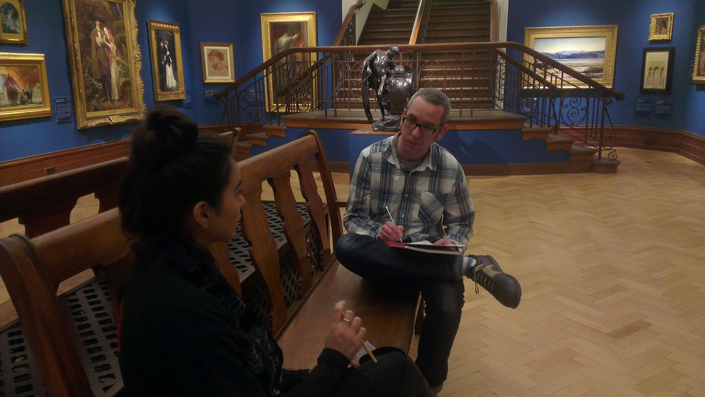
A user research interview being conducted at Bristol Museum
Dan from fffunction conducting a user research interview at Bristol Museum

So for the first phase of the website project, we’ll focus on content which supports visitors in planning visits. We’ll be bearing other tasks and motivations in mind and these will get more attention in later phases of the project, with more user research around them very likely.

New website project kick-off

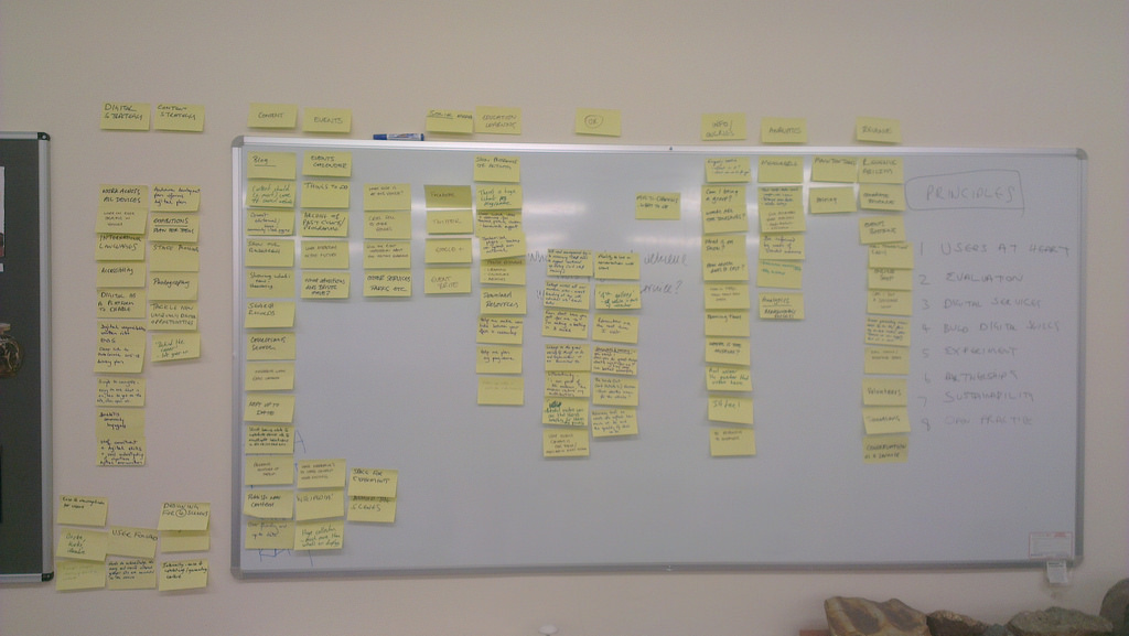
affinity diagram made from our notes
Affinity diagram – the result of considering audience and business needs

We receive over one million unique visitors to our two primary websites, the Bristol museum and Art Gallery museum section hosted on the Bristol City Council website and our own M Shed website. In addition to these two sites, we also have at least twenty other websites and online channels such as brerc, trip advisor, Bristol Record Office and multiple wikipedia entries. Combined, these sites also bring healthy traffic to parts of our service.
Despite having healthy traffic, it was clear that the websites had plenty of room for improvement, both for our audiences and our business needs. For example our internal processes mean that making changes is slow and awkward at best. We also regularly receive public feedback that we are missing key information and that its difficult to understand across the board. Our analytics, which measures web visits (what pages get visited, for how long and much much more!) suggests that current content and/or design is largely ineffective.
I had to write a business case for the first phase which included:

We are seeking to build a phased service-wide website for Bristol Museums, Galleries and Archives to address audience and business needs.
The website will cover all the museum sites and services and focus on evolving our currently unevenly distributed series of websites from a brochure website of static listings, and basic visitor information to a digital platform enabling audience focused tasks and service-wide digital engagement business  focused on addressing our needs beyond our current constraints.

Our website properties have become a destination in their own right for our audience.
During 2012-2013 online we attracted:

  • 1.1 Million unique page views (to the council section and M Shed but excludes our other sites and channels)
  • 20,000 Twitter followers
  • 6,500 Facebook likes
  • 4,500 Mailing list subscribers
  • 8% international audience

We seek to address the needs of both our existing and growing new user base by delivering digital services via the web in line with our strategic objectives. Our evaluation of our visitors through tracking, user surveys and staff feedback, identifies emerging usage trends which our current websites are failing to address to due to existing constraints.
Key performance indicators demonstrate that cost per transaction, user satisfaction, task completion rates and digital take-up must be addressed as a key business need.
The project will adhere to our 8 Digital Principles: Users at the heart, evaluation, digital services, build digital skills, experiment, partnerships, sustainability and open practices which is the start of a long-term commitment to digital delivery.

I met with a small group of recommended web agencies, mostly local, and chose fffunction. We agreed our approach should:

  • Be user focused
  • Be open not just internally but with the public too
  • Run the project in an agile way
  • Make use of the build, measure, learn feedback loop
  • Follow the GDS service  delivery approach oulined in the Service Manual of discovery, alpha, beta and finally live


The first part of the project is called the ‘project kick-off’ and was a day with four key internal stakeholders and fffunction.

We took a look at the biggest opportunities, ideas for direction and established obvious constraints such as time, budget and resource. We produced an affinity diagram (shown in this post) and put this into a public trello for everybody to see the ideas. This formally began the project ‘discovery phase‘ which GDS describe as “A short phase, in which you start researching the needs of your service’s users, find out what you should be measuring, and explore technological or policy-related constraints. will last for 3-4 weeks and cover.
We’ll be sharing more about the project in the coming weeks.