Using Shopify to run an affordable museum shop till system (POS)

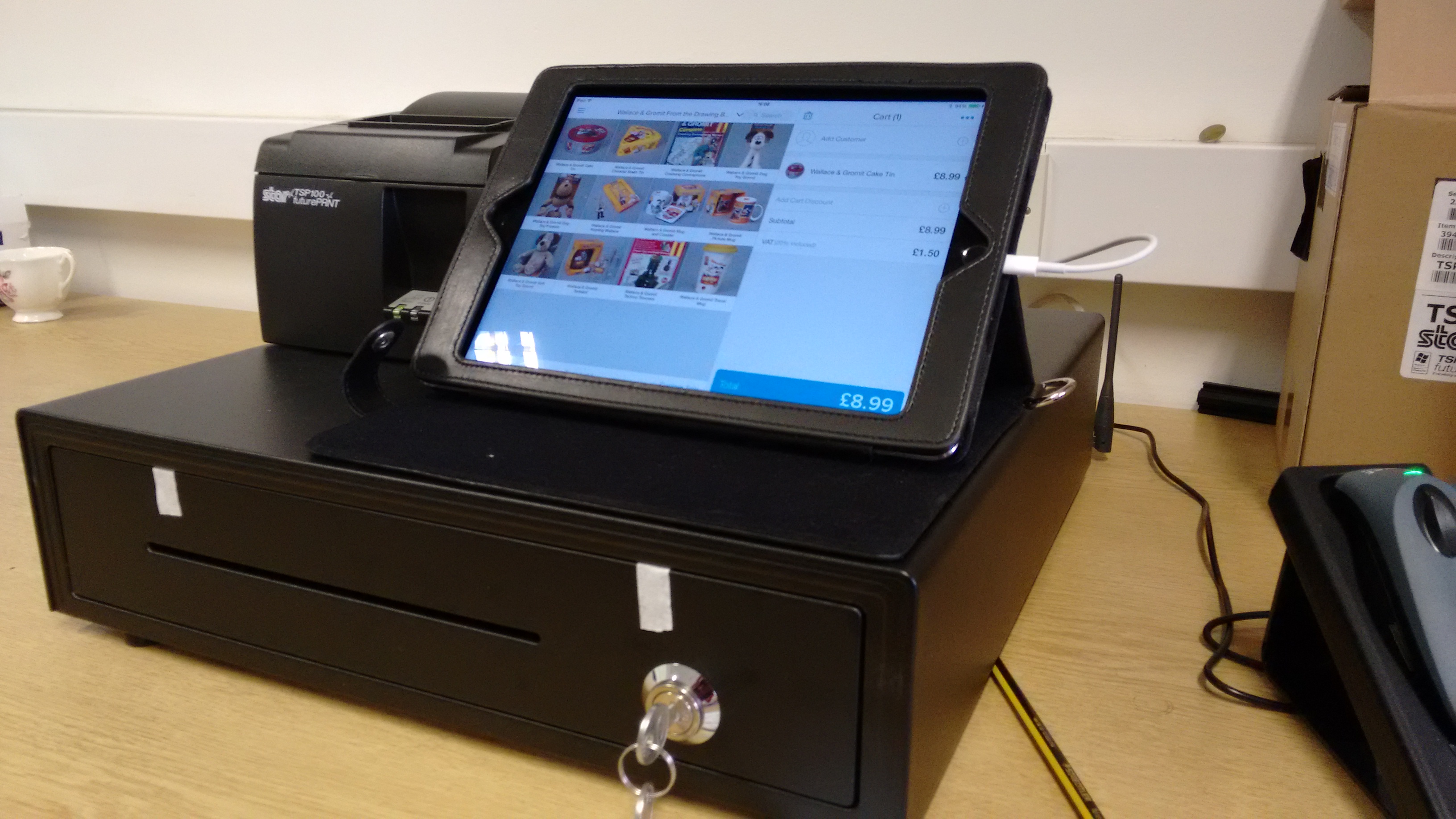
Photo of Shopify till - iPad, till and printer first use

Across the service we typically take payments for our two major retail shops and  ‘paid for’ exhibitions at Bristol Museum & Art Gallery and M Shed. To date we have never set the tills up to give us useful reporting beyond the “groups of products” e.g. ‘books’ or ‘cards’ which is simply not good enough [no shots].  We need useful data to help us understand our business and improve our service. GDS refer to ‘designing with data‘ in their design principles and I see no reason not to be the same across the museums, especially with trading and IT retail systems.

During 2015-16 we will design our retail offer based on good usable data about our visitors, product ranges and sector trends.

Introducing Shopify Point of Sale (POS)

In the not too distant past I used to do freelance web projects and shopify would regularly appear on my radar. It is an affordable (from $9 a month) web shop that recently introduced the ability to run as a till system called Shopify POS. Due to its popularity with web folk I trust, our desire to get a move on and its feature set to cost ratio, I figure we have nothing to lose but try it out – we have no historic data either so anything is better than our current position.

Also, we’re an Arts Council England lead for digital so what better problem to solve than affordable till systems to kick off our 2015-18 partnership?

We will use Shopify POS to:

  • Take cash and card payments
  • Manage our products and stock level
  • Provide both retail and service management with regular performance reports
  • Act as a mininum viable service to help plan for the future
  • Dip our toe in the water with an online shop offer (both POS and web shop are interelated making it easy to do)

Getting started

I made a “management” decision to switch POS and so this is an enforced project for the retail team who have understood my reasoning are behind the project. I have said that we have nothing to lose but this may not work and i’ll hold my hands up if we fail. We had a call with the Shopify team and knew we needed some new kit:

  • Two paid instances of Shopify POS – one for each retail shop. I am disappointed there is to no way to have multiple shops from one account even if it was a discounted upgrade. This will enable us to report accurately each shop as its own business
  • iPad air 2 with Shopify (use the 7 day trial first) with retail add-on and reporting ($59 per month)
  • Bluetooth barcode reader, till drawer and receipt printer from uk reseller POS hardware for approx. £250 ex Vat (turns out you can use any drawer though as they are standard
  • Reuse existing card reader (approx £20 per month)
  • iPad secure stand
  • Router to avoid public wifi and maintain security – fitted by IT services

First steps

  1. Test a proof of concept – Zahid and Tom did a stand up job of getting the system to play nice with our infrastructure and i can’t thank them enough as this proved to be a pain for an unknown reason on our network.
  2. Once we had our test ‘alpha’ system working, we confirmed that IT were happy for us to proceed. They generally like projects that they don’t have to get involved in too much! As we’re using the existing corporate contract for our card payments which never touch Shopify there isn’t a security risk at that point AND it doesn’t touch our finance system. Essentially Shopify is “off” the network and at worse we expose our reporting and products – secure passwords for staff is the biggest challenge!
  3. Add our MANY products. Our retail and admin team are working on this at the moment
  4. ‘Beta’ Test over the week of 27th April alongside the existing system with our retail manager Helen who is critical to the success of the project
  5. Show the retail team how to use the system and get their feedback – after all they need to use and champion the project and service

Next steps

Assuming staff are happy and we’re getting the data we need I plan to put the service into ‘live’ starting 1st May so we can get 11 months usable data. We’ll be sharing our progress on the blog. PLEASE get in touch if you have anything to help us make a better service or have any questions.

A full shop till system for unless than £1000 a year…..let’s see!
 

Project Insight: Half Way Point in the User Testing

We have reached the half way point in the user testing phase of the research which began on the 11th April and will run till the 3rd May. I just thought I would provide a quick snapshot of how things are shaping up in the museum.  To begin, some numbers; so far we have been in the museum on seven individual days and during that time 39 groups have taken part (=5-6 per day). In total, 125 individuals have taken part in using the app. I have interviewed the majority of the groups.

Issues on the ground

We have had a few logistical and technical issues along the way, so I will highlight three of these before I summarise some of the key parts of the research so far. Bad news first…

Issue 1 — The first significant problem we have encountered was on Sunday 12th April. Frances and I had to close down testing because the top floor of the museum was closed. This was due to a staff absence. When we found out the museum was partly closed-off, we quickly realised that the app will not function as there is no option to ‘skip’ a room if the app sends you there. The upshot is simply that it is important to check with the museum staff that the museum is operating normally.

Issue 2 — On Sunday 18th, we came across our first significant technical problem. When I attempted to open the app, a notification popped up saying that the Beta testing period had expired. Fortunately, my quick thinking volunteer came up with a temporary solution (manually changing the date on the iPad). I contacted Laura and she put Mark on the case to fix this which he did. However, this issue remains in play; the app needs to be ‘reset’ each month – something to keep in mind if we do any further user testing after the 3rd May (e.g. on the 10th June for our festival of education session).

Issue 3 — The third problem is an ongoing one which seemed to peak on Sunday 18th – the app/ibeacons occasionally not locating effectively. On the vast majority of occasions, the app is locating the user and it finds them and they get the ‘ping’ when they enter them room that they have been directed to. However, on occasion this doesn’t happen. On Sunday 18th it just so happened that this problem was experienced by three groups who all then returned the iPad because they couldn’t continue with the app (despite multiple attempts by users to be located by walking around and waving the iPad etc.). This sparked us to have a troubleshooting session in the museum on Monday 20th April…

Troubleshooting session in the Museum – 20th April 2015

Aardman Team Troubleshooting in the Museum

Initially the general thinking was that the depleting battery life of the iBeacons was causing the performance of the app to become unreliable. However, the troubleshooting session with the Aardman technical team (Mark, Nate, and another colleague), revealed that the batteries were minimally depleted with most showing around 90% power remaining. Good news! Most of the iBeacons were installed around October so they are faring well after around six months – this is a big positive in terms of reducing the level of resources required for ongoing maintenance (should they need it).

The sort of bad news, however, is that the troubleshooting session couldn’t specifically identify why the app is intermittently and seemingly randomly not locating users. We generally acknowledge that it can be temperamental at times, and in essence we have simply to work with it being that way. Nate reminded me that one solution for users is to click the ‘open map’ button if it is not locating them and this should give it a kick to find the user – I am now telling users this when I set them up on the app. I think the reality, for the time being at least, is that the app does require a degree of patience from users. Having said that, to reiterate, the app is working almost perfectly a lot more often than not and technical problems are rarely reported back to me in user feedback.

General news from the user testing

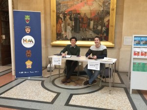
HM Desk Front Foyer
Hidden Museum Desk

One of the bigger changes we have made since the pilot research was to move the Hidden Museum desk to the main foyer – a good move.  You can also see from the photo that we also have our Hidden Museum banner in place. It is fair to say that this has very much improved our general look and visibility and has also increased interest. Relatedly, we have changed recruitment tactics to include on-the-day recruitment, which means we are now inviting visitors from within the museum on the take part. This decision was taken partly because people were asking to take part and we felt like it was defeating the point if we said no, and because it feels like there is only so much that can be done through twitter and online registration. I would say that the combination of the two recruitment methods (online and on-the-day) is favourable. To note, users that we do recruit on-the-day are still required to provide ID and to fill-out the consent form in order to take part.

Feedback from users

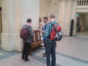
User Testing HM App
User testers getting going in the museum foyer

Feedback from users has generally been very positive. It is difficult to summarise the feedback in this short space but I will note a couple of things. Where most users agree is on the question of ‘is there a place for the integration of digital technology like the app into the museum experience?’ – the answer has been a resounding ‘yes’, and users have been very clear that they think the concept of the app is great and should be given support.

Secondly, and this is good news, the app appears to be fulfilling its most basic objective – getting visitors to parts of the museum they don’t usually go to. The response on this has been virtually unanimous; the app is taking visitors to the less visited parts of the museum, and for the most part they are finding the experience of going to those parts of the museum interesting and valuable.

With regards to the more critical comments, they are certainly there but they are quite varied so they are difficult to capture at this stage. I will highlight one, and that is the issue of ‘pace’ – quite simply users are not so keen on how fast they end up going around the museum when using the app. When children are part of a group this issue is especially pronounced as they are often leading the group and responding primarily to the app and the instruction to move on. Initial ideas to overcome this include the option to ‘have another challenge’ in the room, or, perhaps an instruction to ‘explore the room before moving on’. Of course, these issues require fleshing out before they can be addressed.

That’s it for now.

Keep spreading the word for people to get involved in the user testing by signing up in advance or dropping in!  @hiddenmuseum

Darren Roberts

5.13 Project Insight – Joining Hidden Museum and Beginning the Research Phase

This blog is about my thoughts on joining the Hidden Museum project and the partnership with Aardman and Bristol Museum and Art Gallery. I use my experience of going to the museum and meeting some of the team for the first time (early April). I also use this as an opportunity to unpack a bit about the research we will be doing on the project during April and May (see also milestone 4.4 for further info about the research design).

To begin; some context … I have just begun a research assistant role on the Hidden Museum project. I will be based at the University of Bristol within the Graduate School of Education and will be working with Dr. Frances Giampapa. The second bit of context is that the research we are conducting is focused on questions about how the Hidden Museum game app affects the nature of interaction, learning, and engagement among museum users (I will unpack this below).

Before I go on to explore some of the research themes, the first thing to say (and I think it is worth saying) is that I am excited to know the museum it will be my research location for the next couple of months – it’s a fascinating place. Secondly, it was real a pleasure to meet some of the Hidden Museum team (Gail, Laura, Jake, Amy, and Al). When speaking with you, what quickly came to mind from a research perspective was the need to include and, to some extent, start with your ideas and understandings of the key research themes such as ‘digital technologies’, ‘museum cultures’, and ‘engagement’. (The following week I got the chance to interview Laura and Jake from Aardman and Gail from the Museum about this). Third, I thoroughly enjoyed my experience of using/testing the Hidden Museum app.

Testing the app and the research themes

Generally speaking, what social scientists like Frances and I do is use qualitative and/or quantitative data to build up a ‘narrative’ about a topic (e.g. a place, or community, or set of practices) which we then analyse within a particular framework. Here the aim will be to develop a narrative about the three intersecting themes of digital technologies, museums, and learning/engagement. We will collect qualitative data through observation and short interviews and analyse it using ideas from education studies literatures. It is on this platform that more ‘layers’ can be added. For example, in the team meeting, we began discussing the possibility of incorporating questions about socio-economic diversity. This prompted ideas about potentially inviting particular groups from more deprived areas of the city to use the Hidden Museum app. In turn, it was suggested that this could form the basis of a small case study within the research.

The observation part of my research began to take shape from my first visit to the museum both because I got the chance to go around the museum and get to know the space, but I also got a chance to use the Hidden Museum game app – Frances, Amy, and I (all first-time users) played the Hidden Museum game in a team of three. Despite some initial technical hitches, which were speedily and impressively resolved, the game successfully revealed a hidden museum as it directed and delivered us to different parts of the building. For me and Frances, the question we are interested is, in what ways did the Hidden Museum game app shape or change how we engaged as visitors to the museum? To me it seems that one of the keys to answering this question is unpacking what we mean by ‘engagement’ and by thinking about the multiple ways that we engage. That is, to think of engagement as a combination of different forms of engagement. So, for example, on one occasion the game asked a member of the group to find out a fact about the item and then to quiz the other group members on the item. In response to the app a form ‘social’ engagement occurred as our group interacted and collaborated in the quiz. A ‘creative’ engagement occurred as one member of the group had to construct a meaningful question on the spot about a museum object. And a new ‘emotional’ engagement occurred as one group member slightly panics to come up with a question and the other team members wait with a degree of anticipation and playfulness.

Additionally, it is not always about the increase of engagement, for example, engagement with digital technology, especially the iPad and the game itself, fluctuates. This is something the team were discussing at the meeting, especially the idea that the app is designed to discourage the users from over-engaging with the game or the iPad in order that they could engage more fully in other ways with the space of the museum, with their group, and with exhibitions and items in the museum.

I hope this ramble has gone a little way in providing an insight into some of my initial thoughts as a researcher on the project and how we develop our side of things. I look forward to learning about how people will use the Hidden Museum game app in Bristol Museum and Art Gallery.

Darren Roberts

5.5.1 Reflections on Hidden Museum Pilot Days

On the 1st and 2nd of April the research team carried out a two day pilot for the Hidden Museum game app. The aim of the pilot was to test each aspect of the app and the user experience ahead of a more extended testing period. Overall, the pilot proved a success both in terms of the logistics and technical aspects of the app and in terms of a positive user experience. Here, I just want to discuss these two aspects in a bit more detail (including reflections on the interviews and observations).

Logistics and Technical Aspects

The research days were lead by Darren and Frances. Technical support was provided by Nate from Aardman. Research support was provided by our research volunteer, Amy. Laura and Jake from Aardman also provided help in getting us setup both days.

Over the course of the two days a total of 16 participant groups (1-6 participants per group) took part. This equated to 44 individuals taking part. Of the 16 groups that took part Darren conducted interviews with 14 groups. The length of interviews ranged between 7 and 20 minutes with an average of around 15 minutes. Alongside the interviews, both Darren and Frances conducted observations around the museum on both days. In addition to the research activities, Aardman employed a camera man to film the two pilot days; the footage will be used to produce a short promotional video for the Hidden Museum project.

From a technical perspective the pilot days went very well, the App and the iBeacon technology performed very well. There were no reports of any failures in the technology. A few of the groups commented on moments where the app did not recognise their location in the museum. When this did happen it was not noted to be a particular hindrance to the overall use and experience of the App. I believe that Nate from Aardman had noted down a couple of technical issues which he could report back to the developer.

The participant groups that took part in the pilot were recruited from friend and colleague networks from within the participating organisations. Those who wanted to take part were invited to register on an Eventbrite page – this worked well and will be used for the full research phase. On the first pilot day, we setup our Hidden Museum desk in a space on the ground floor in the Curiosity exhibition. This was chosen as it had a small area which is relatively secluded. Participants were given details of where we would be located on the Eventbrite page, otherwise they could ask the staff on the front desk. When Participants arrived they were asked to fill-in a consent form – this was very successful and will be used in the full research phase. After this, they were setup on the iPad and were given the opportunity to play the Hidden Museum game app. When they had completed the game, they returned to the Hidden Museum desk and were then invited to take part in a short interview (as noted, the majority did so).

Interviews

The interviews were conducted with 14 of the participant groups. The aim of the interview is to get an insight into how the use of Hidden Museum game app affects the visitor’s experience of the museum. The nature of the interviews varied depending on the group, for example, those with children had different questions to those without. The general theme of the questions was understanding how the app affected their ways of engaging in the museum, including: how they engaged with members of their group; with the exhibitions and items in the museum; with different emotions; with the digital technology of the iPad, and so on. As well as this, many of the participants gave specific feedback on the app itself, and many offered their thoughts on potential additions or improvements.

Generally, it has to be said that the feedback about the experience of using the app from participants was very positive. To put it simply, the app worked and it overall, in terms of the pilot days, it had its desired effect – the participants all but unanimously said they went to parts of the museum that either they had not been to before or that they rarely went to or that they thought they were not  interested in. In this sense, the app had a considerable affect on the ‘where’ the participants went in the museum. Again in most cases this change was very welcome and was viewed as something which enhanced their experience of the museum. Another interesting thing that came out of the interviews was the affect the app had on the ‘imagined identities’ of different individuals in the participant groups. For example, a number of the groups with children explained how the app allowed for a kind of role reversal whereby the children ended being ‘in charge’ of the museum experience rather than the parents/adults. On the flip side, a number of the adults explained how the app encouraged them to be more ‘playful’ than they would usually be in a museum setting. In other words, some of the expectations about how children, adults, parents, friends etc. should behave in a museum were challenged and new behaviours and ideas how to behave in a museum emerged. This is an area of the research that we will explore further. Finally, it is worth noting that in the small snapshot we obtained through the pilot, it appears that the coming together of digital technologies and museums is one that visitors both intuitively understand and find rewarding, but moreover, it is one that many perhaps are increasingly expecting.

Observations

The observations were conducted across the two days with X groups (FG observed 3 groups (1x two adults and 3 children; 1x 2 adults and two children; 1x 4 adults).  The average number of games played on the app were two.  In the mixed adult and children groups the children led on the app and there was a lot of talking, excitement and running around to search for objects.  For all of the observations conducted by FG, the groups were driven up to the areas such as the Bristol Artists, and Ceramics.  It was noted that these were areas that groups had not visited before despite seeing themselves as knowledgeable museum regulars.  At times groups would disperse to look for the hidden object and then come together with one group member reading out loud the information.  The flow and movement of groups was quick paced and there seemed to be pauses to read signs and work with the app’s compass to get to the next space.  Interestingly, it was the adult group that seemed to have difficulty finding their first two objects – mainly due to understanding and attention to what the app was describing.  Once they did find an object (on their third attempt) it became a motivator for continuing with the game and it drove their enthusiasm to explore further.  The ‘treasure hunt’ feel was noted by many of the players and this did work as a strong motivator.

Darren Roberts and Frances Giampapa

Working with the University and the Museum

This post is a short summary of how us lot at Aardman found it working in partnership with Bristol Museum and Bristol University.

Partnerships

We are well versed in building partnerships with our various clients – be it to produce TV commercials, video games or digital tools. The Hidden Museum project pushed the partnership model to another level – with three equal partners, all aiming to achieve a goal that we defined ourselves, and trying to figure it all out together as we went along.

The Digital R&D Fund for the Arts requires project teams to have 3 partners from set disciplines: An Arts partner, a Research partner and a Tech partner. This interdisciplinary trinity forms a super-stable foundation on which to work; the Museum provided the requirements, context and content, the University provided the objective framework, and we provided the means, management and distillation of everyone’s ideas. Although of course in reality these distinctions blur a lot…

Project management

As a group of 3 very busy organisations – each with our own respective teams – it was invaluable to have one point for all project management. And luckily we were very privileged to have two partners who were happy to bend their usual way of working to how we do things at Aardman – organising the work and collaboration around our usual agile structure.

It really helped to have everyone local, who were able to meet up on short notice (and at minimal expense), and shared a willingness to use all used the same communication tools. We generally used Basecamp for communications, Trello for task lists, and met regularly for sprint planning and closedowns.

Emphasis on research

The research goal of the project really helped shape our user stories by those that would best answer the research questions, rather than getting carried away by the technical wizardry at our fingertips, or the huge breadth of content at the Museum. And the R&D focus liberated us all to genuinely respond to user testing results – a rare privilege when working commercially.

Integrated expertise

Our close partnership enabled the museum’s senior curator Gail Boyle to be such a key member of the team – helping design the product in full context of the space, and providing in-depth knowledge about the museum and its collections – as well as a massive willingness and effort to create all the content… a huge undertaking!

It’s not over yet…

For the time being we’ve now come to the end of our role in the project, and it’s now ready for the research team to finish their testing to find out how this kind of technology really impacts museum visits. It’s been a great process – both liberating and focused – which has provided huge insights into each of our different worlds. Long may the partnership continue!

5.13 Passing on the app – Hidden Museum Development

Progress

Last week we began our pilot testing: it’s time for all the hard work we’ve done to be prodded and poked by people who have never heard of the project and who have no personal investment in its success. This is a somewhat daunting proposition since we clearly want visitors to love what we have created but for us also to be able  learn from our testers as ‘critical friends’ and trust they will highlight any mistakes!

My role

Most visitors need a real helping hand to get around a building created over several floors and split levels.
“Most visitors need a real helping hand to get around a building created over several floors and split levels.”

As an experienced museum curator I am used to telling stories (interpretation) using a variety of different tools – these might include 3D real objects, images, AV, IT, graphic text, physical and mechanical inter-actives. I like to think that in creating the Hidden Museum we will be adding to the varied menu of possibilities we provide which enable our visitors to engage with our collections, with the space (museum) and especially with each other. My role has been to help inform the user journey from a museum perspective and to learn more about how we might better approach visitor engagement utilising new technology. It has also been my task to liaise with project partners who have no direct knowledge of the collections or experience of delivering ‘museum style’ interpretation, public visiting habits, desires, wants and needs, or of the intricacies of an Edwardian building. Clearly it has been just as important for me to be guided by them and the fresh perspectives they bring since we want this app to be innovative in its approach rather than just a digital version of things we already do – its been a good to have our assumptions challenged by each other and to learn new skills from each other too!


Content

Who knew we didn't have an image of one of our biggest specimens?
Who knew we didn’t have an image of one of our largest specimens?

I have mainly been responsible for the collation and creation of the museum ‘assets’ we needed in order to be able to populate the app with content. Having worked on the delivery of a number of software based AV/IT inter-actives at M Shed I knew that this would always take longer than anticipated and true to form it did! We are fortunate to have a sophisticated collections management system (CMS)that contains high quality images of objects, so some of those we required could be sourced this way: others proved more elusive and I often found myself running up and down the stairs to various galleries to take just the right shot or to check a detail.

The biggest question we needed to resolve was how objects would be linked together across galleries and how playful we could be with this . We began by looking at some pre-existing paper-based trails used on museum activity days but after preliminary user testing we realised these were too prescriptive and we needed a much more interesting, dynamic  and perhaps more random way of linking objects together. We used our CMS to create a digital data set of all the items on display with images attached to their records and then began to interrogate this by randomly selected keywords: the latter produced more playful connections, for example, the word ‘fish’ linked live specimens in tanks in one gallery with oil paintings in another.  Although this method started to lead us in the right direction we didn’t manage to refine our thinking until after we’d analysed the feedback report from our ‘Kid In Museums’ testing day.

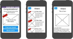
"Wireframe images within templates helped to keep content consistent"
“Wireframe images within templates helped to keep content consistent”

Themes began to emerge that could be interpreted in a really flexible way based on words such as ‘weird’ or ‘oops’, but these weren’t words that generally appeared in our databases and so we had to resort to pounding the galleries to create lists of possibilities.  In order to achieve a consistent approach, and for easier referencing whilst uploading content, we agreed that we would work to two templates: one that set out game content and the other museum ‘secrets’. The latter act as  the ‘rewards’ given to players after they complete each game in a tour. These are designed to be exclusive to the Hidden Museum experience  and so needed to be more revelatory  or anecdotal than anything that can be found on a museum label. Interesting discussions took place between the partners as to what words should or shouldn’t be used to describe each theme. The word ‘weird’ became ‘extraordinary’ since it was felt the former could have been easily misconstrued in a negative or insulting way , whilst ‘oops’ became ‘broken’ because that more adequately reflected the objects represented within the theme.

Journey

This is not the end of the road as far as my role is concerned since we will almost certainly need to refine the content based on our user testing and research. At the beginning of the project were were working in ‘sprints’ – the first round of these involved all project partners but then each one of us played different roles and had differing degrees of responsibility for its delivery over time. The technical and museum teams have now passed the baton well and truly to the research team who will be gathering data ready to feed back to us all  – can’t wait to see and hear the results!

5.13 Staying focused on the Hidden museun


One of the insights I’d like to share about our partnership thus far is that working together over a long period takes focus. Oh and this focus will wobble up and down. Since the start of the project each partner has probably worked on 5-10 other projects plus “other stuff called our lives” for example I’ve had my first kid, got promoted and lost a bunch of sleep. Others have had similar life-changing situations. Yet we’re all still committed to the Hidden museum and supporting each other. We used to meet every fortnight in the aardman cave to review our progress and motivate each other. Yet once got our prototype running there was a period of silence. … Well except for the sounds of our project manager rightfully hounding us for later than promised paperwork – we’re sooo sorry. To stay focused takes effort. Not effort to plan, code or observe, but to stop for a moment and drop each other a line “hey guys lets hook up” and so here we are again. All huddled around Basecamp, trello and the faint glow of an iPad to unleash our hard work onto the public for the pilot launch. Aardman came with sticker packs, Frances and darren with recording devices and questions and us with the spaces, 16 iPads and hoards of eager public.


How far we’ve come. Onwards, focused and eager to show and tell.

5.5.3 Technical accessibility review – The Hidden Museum App

Early on in our production we discussed levels of accessibility required for this app.

As a company, Aardman feel very connected to accessible digital products – we have created some highly accessible products in the past, the most accessible of which had to be the Something Special games which include a range of settings for users of all cognitive and physical abilities. We are well versed in the creation of accessible apps as well so we felt well prepared to advise as to suitable levels of accessibility for this product. And in one of our most recent mobile games CBBC’s Escargot Escape Artistes, as well as using only the most simple of gestures to play the game, players can choose to play it using their voice alone – without any physical input.

Since this is a research project and full accessibility can become a project all in itself, we decided that our goal would be to be ‘as inclusive as possible’ within the constraints of time and budget.

As a result, we decided that if we were going to target a single device for this research phase, that we should target iOS devices since these are known that these have the best accessibility features as standard. As a result we decided to deploy to a test base of iPad Air 2’s for this research testing.

We also ensured that all text was a minimum height on screen and that colours used in the designs were compliant with the general colour blindness guidelines for web design.

In terms of the app’s design, at first when we were leading users around the museum, care was taken to establish whether the user was able to use stairs or not. As the game design has moved away from a ‘led’ tour into more of a general guide we have not had to establish this but have always offered users routes via stairs or lifts in the map view of the app to ensure that all abilities are catered for in that way.

4.2 Trying out the Hidden Museum Game by Emma

Notes from Emma, our marketing apprentice who had the following to say after trying the app for the first time:

Before you start the game

select from some options what you want (player number, ages, time etc)

  • If already (from the last game) on the “highlighted option” I want – I don’t know if it had been selected for me. Maybe something to indicate it, e.g Change colour? Sound? Vibrate like movement
  • I selected “1  player”. Then it says who want to go first? – Obviously me. Silly irrelevant question. Unless you are playing against the computer (you’re not) which at this point isn’t obvious
  • Pick “badge” – ? Is that term unusual? …Usually ‘character, player’. Also your ‘badge’, character choice doesn’t appear later on … to the user -could seem irrelevant then…
  • A bit slow to scroll through. And it has to be in the centre of the screen to be selected (even though you can see the edges of the previous and next badge.) (Perhaps two { O } lines, brackets to suggest where it need to be placed to be selected)
  • Say “how long” ‘not long’ is as different people have different ideas, interpretations of how long ‘not long’ is. (Be clear ‘not long – 10-20mins’ so people know what they are getting and how much of the game they can roughly do.) I’m not sure people would want to commit to one hour. Would the second option be something like ‘40mins- one hour’

Playing the game

  • Exciting and fun – I’m not going to lie. It really is. I would play it again (I did) too
  • Reminded me of an Easter egg hunt…
  • Info – short, and interesting enough
  • I DO NOT like the count down on the map (and not necessarily enough time) I feel under pressure. Not in a good way
  • Made me view things in gallery/section that I wouldn’t normally, perhaps to be attracted to
  • Nice being led
  • Too much running around! Okish if you are on your own, can’t imagine that working in a big group (e.g family of 4) as you might get distracted as you get from A-B …(should be able to pick where you want to play the game e.g what floor/section).
  • I personally wouldn’t want to/cba to find/ask a member of staff something.
  • If you don’t find the object, you still have to take a picture of it…
  • from our visitor assistant –Colours not on brand?! Doesn’t appear very Bristol Museum & Art Gallery like
  • The right amount of looking at a screen vs. looking around you
  • Like the interaction – taking a picture.

4.2 Alex and Fay test the app

We (Alex – volunteer co-ordinator  and Fay – User researcher) spent a lovely half an hour wandering round the museum with the app, discovering some things that we hadn’t discovered before – we thought it was very fun and simple to use.

We got a little confused at first as it asked how many players there were and took our ages – we thought this meant we might be playing against each other (and got ready for a bit of competition!). The only game that did ask us to play together was in the geology gallery, where it asked us to find something broken. We were a bit confused by this, what with it mostly being natural objects like rocks and fossils. We later realised that there was a broken bone that we could have chosen but this did require some creative thinking! We also weren’t too sure what the numbers next to the game themes were – were these our scores? We worked out they were the amount of games that we had completed. Should they be reset each time someone new starts playing?

At one point we were sent along to the Curiosity gallery, where we were asked to find an object – a broken pot – which we couldn’t find anywhere! Turns out it was in the under 7s area (where you have to take your shoes off). We wondered why it might take us into there being two adults… By this point we’d run out of time and the app assumed we had found it. At the end of the countdown there was nowhere to say that we hadn’t found the object and I ended up having to take a picture of something random to move it along.

We really loved the things we unlocked for completing challenges, but they didn’t seem to be relevant to the areas that we were in. The first one we did gave us some lovely info about the RWA after we’d taken a picture of the ichthyosaur, and one in the geology gallery told us about objects we assumed must be in the Egypt gallery – we thought it might be nice to have been given snippets of info about objects in the galleries we were in, so we could go and have a look straight away before moving on to the next game.

We really enjoyed moving round the museum with the map and loved how it alerted you about where you were – that worked really well.

Supporting evidence for milestone 4.2 – informal user testing