We’ve been beavering away creating characters for our app. Creating a style for this exercised our grey matter somewhat!
We needed to create a look which complimented the very clean visual style that our lead designer for the project, Sarah Matthews created for the app. However, from our years of experience in creating characters for apps and games we know that younger children react much better to characters with an element of realism to them.
In user testing we trialed 3 potential styles:
A photographic style, using photographs of artifacts from around the museum:
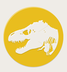
A silhouetted style, which fits very well with the UI design, but is much less realistic in style:
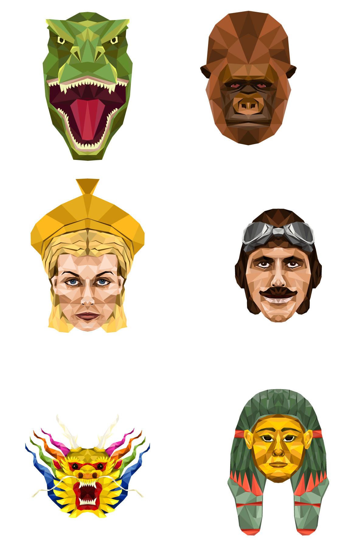
A geometric style, which is stylised like our UI design, but has much more realism:
The overwhelming vote was for the geometric style, which thankfully our production team all liked too – so we decided to go down this route.
Next we had to decide what our characters should be – we had some ideas and Gail was great at helping us to hone these down. We wanted them to really represent the diversity of the exhibits at the museum, and also be appealing to all age groups and both males and females. So we settled on the ubiquitous dinosaur, George Peppard the boxkite pilot who flies the plane in the main hall, a chinese dragon head as represented in the chinese dragons over the stairs int he main hall, a roman goddess to represent the museum’s wealth of roman artifacts, a female Egyptian Mummy with gorgeous coloured paint and… Alfred the Gorilla (obviously!)
Here are the results!
Still a bit of work to do on the Mummy to make her a little more female, but more or less there.


