Hello! My name is Rowan Whitehouse and I am currently working as a cultural support apprentice for Bristol Museums.
I have been doing six week rotations around various departments, and as part of my third, with the digital team, I’ve been asked to review some of the technology around the museum.
So, to find some!
I noticed that the distribution of technology around the museum is heavier in areas with a higher number of children. Whilst there is a lot around the ground floor, particularly the Egypt and Natural History galleries, levels definitely drop off the more steps you climb, towards the Fine and Applied Arts galleries. I think this is due, in part, to many children’s interests leaning on the dinosaur/mummy side, rather than Bristol’s history of stone pub ware. Perhaps there are also certain established ideas about what an art gallery should be, whereas many of the historic collections lend themselves well to interactive displays.
Upstairs, the technology has a distinctly more mature focus.
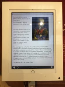
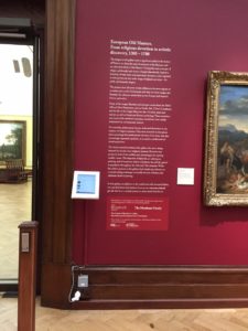
I chose to look at a tablet/kiosk in the European Old Masters gallery for an example. The kiosk itself fits well into its surroundings, the slim, white design is unobtrusive – something desirable in such a traditional gallery space. The kiosk serves as an extension of the wall plaques, it has an index of the paintings in the room with information on them. I think this is a great idea as the size of wall plaques often constrain the amount of information available.

A big drawback I felt however, was that the kiosk was static and fixed in one place. I observed that as people moved around the gallery they would continually look from the painting to it’s accompanying plaque, taking in both at the same time. Though the kiosk has more information, it would need to be able to move with the user to have the advantage over the plaques. On the position of the kiosk itself, I think it would receive more use if it was positioned in the middle of the room, rather than in the corner, where it is overlooked. Signage on the wall advertised a webpage, which could be accessed on a handheld device and provided the same information as the kiosk. I felt this was a better use of the index, and could be made even easier to access via a QR code. I wonder though, if people would want to use their phones like this in a gallery, and whether ideas about the way we experience art are the ultimate obstacle. I’ll be researching how other institutions use (or don’t use) technology in their galleries.

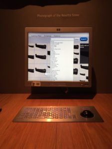
I wanted to see how technology is being used differently with the historic collections, so I headed back downstairs to the Egypt gallery. I observed a school group using the computers at the back of the gallery, both the children and their teacher struggled with the unusual keyboard layout and rollerball mouse, unable to figure out how to search. Eventually, they came upon it by chance, and enjoyed navigating the images and learning more about the objects in the gallery. The computers also have a timeline view, showing the history of the Egyptians, and an “Explore” function, where specific subjects could be looked at.
I think the location of the units massively benefit interaction, the dedicated space with chairs really invite and encourage visitors to engage. On using the technology, I felt that the access problems could be easily fixed by some stickers highlighting the left mouse button function, and something to resolve the stiffness of the rollerball.

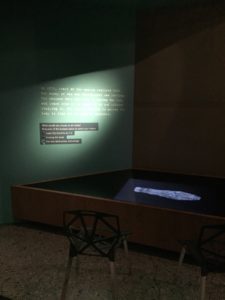
My favourite interactive pieces in the museum were in the Egypt gallery. I loved the screens that featured the discovery of a body, and asked the user what they thought about the body being in a museum, and gave the user the option of viewing the body at the end of the text. I felt like this type of interaction was fantastic, and rather than just providing information, engaged the visitor directly and was a great way of broaching questions that may not usually occur to visitors.
I’m looking forward to the next six weeks, and learning more about digital engagement in museums.
With such a fantastic collection, it’s exciting finding new ways of presenting it and helping visitors interact with objects