Tag Archives: hidden museum

Project Insight: Half Way Point in the User Testing

We have reached the half way point in the user testing phase of the research which began on the 11th April and will run till the 3rd May. I just thought I would provide a quick snapshot of how things are shaping up in the museum.  To begin, some numbers; so far we have been in the museum on seven individual days and during that time 39 groups have taken part (=5-6 per day). In total, 125 individuals have taken part in using the app. I have interviewed the majority of the groups.

Issues on the ground

We have had a few logistical and technical issues along the way, so I will highlight three of these before I summarise some of the key parts of the research so far. Bad news first…

Issue 1 — The first significant problem we have encountered was on Sunday 12th April. Frances and I had to close down testing because the top floor of the museum was closed. This was due to a staff absence. When we found out the museum was partly closed-off, we quickly realised that the app will not function as there is no option to ‘skip’ a room if the app sends you there. The upshot is simply that it is important to check with the museum staff that the museum is operating normally.

Issue 2 — On Sunday 18th, we came across our first significant technical problem. When I attempted to open the app, a notification popped up saying that the Beta testing period had expired. Fortunately, my quick thinking volunteer came up with a temporary solution (manually changing the date on the iPad). I contacted Laura and she put Mark on the case to fix this which he did. However, this issue remains in play; the app needs to be ‘reset’ each month – something to keep in mind if we do any further user testing after the 3rd May (e.g. on the 10th June for our festival of education session).

Issue 3 — The third problem is an ongoing one which seemed to peak on Sunday 18th – the app/ibeacons occasionally not locating effectively. On the vast majority of occasions, the app is locating the user and it finds them and they get the ‘ping’ when they enter them room that they have been directed to. However, on occasion this doesn’t happen. On Sunday 18th it just so happened that this problem was experienced by three groups who all then returned the iPad because they couldn’t continue with the app (despite multiple attempts by users to be located by walking around and waving the iPad etc.). This sparked us to have a troubleshooting session in the museum on Monday 20th April…

Troubleshooting session in the Museum – 20th April 2015
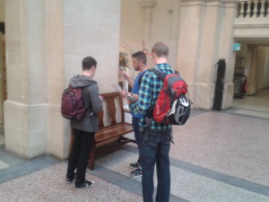
Aardman Team Troubleshooting in the Museum

Initially the general thinking was that the depleting battery life of the iBeacons was causing the performance of the app to become unreliable. However, the troubleshooting session with the Aardman technical team (Mark, Nate, and another colleague), revealed that the batteries were minimally depleted with most showing around 90% power remaining. Good news! Most of the iBeacons were installed around October so they are faring well after around six months – this is a big positive in terms of reducing the level of resources required for ongoing maintenance (should they need it).

The sort of bad news, however, is that the troubleshooting session couldn’t specifically identify why the app is intermittently and seemingly randomly not locating users. We generally acknowledge that it can be temperamental at times, and in essence we have simply to work with it being that way. Nate reminded me that one solution for users is to click the ‘open map’ button if it is not locating them and this should give it a kick to find the user – I am now telling users this when I set them up on the app. I think the reality, for the time being at least, is that the app does require a degree of patience from users. Having said that, to reiterate, the app is working almost perfectly a lot more often than not and technical problems are rarely reported back to me in user feedback.

General news from the user testing
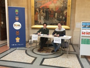
HM Desk Front Foyer
Hidden Museum Desk

One of the bigger changes we have made since the pilot research was to move the Hidden Museum desk to the main foyer – a good move.  You can also see from the photo that we also have our Hidden Museum banner in place. It is fair to say that this has very much improved our general look and visibility and has also increased interest. Relatedly, we have changed recruitment tactics to include on-the-day recruitment, which means we are now inviting visitors from within the museum on the take part. This decision was taken partly because people were asking to take part and we felt like it was defeating the point if we said no, and because it feels like there is only so much that can be done through twitter and online registration. I would say that the combination of the two recruitment methods (online and on-the-day) is favourable. To note, users that we do recruit on-the-day are still required to provide ID and to fill-out the consent form in order to take part.

Feedback from users
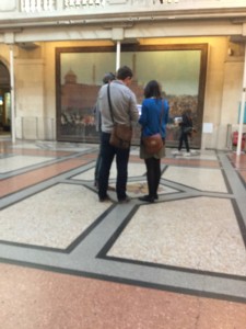
User Testing HM App
User testers getting going in the museum foyer

Feedback from users has generally been very positive. It is difficult to summarise the feedback in this short space but I will note a couple of things. Where most users agree is on the question of ‘is there a place for the integration of digital technology like the app into the museum experience?’ – the answer has been a resounding ‘yes’, and users have been very clear that they think the concept of the app is great and should be given support.

Secondly, and this is good news, the app appears to be fulfilling its most basic objective – getting visitors to parts of the museum they don’t usually go to. The response on this has been virtually unanimous; the app is taking visitors to the less visited parts of the museum, and for the most part they are finding the experience of going to those parts of the museum interesting and valuable.

With regards to the more critical comments, they are certainly there but they are quite varied so they are difficult to capture at this stage. I will highlight one, and that is the issue of ‘pace’ – quite simply users are not so keen on how fast they end up going around the museum when using the app. When children are part of a group this issue is especially pronounced as they are often leading the group and responding primarily to the app and the instruction to move on. Initial ideas to overcome this include the option to ‘have another challenge’ in the room, or, perhaps an instruction to ‘explore the room before moving on’. Of course, these issues require fleshing out before they can be addressed.

That’s it for now.

Keep spreading the word for people to get involved in the user testing by signing up in advance or dropping in!  @hiddenmuseum

Darren Roberts
5.13 Project Insight – Joining Hidden Museum and Beginning the Research Phase

This blog is about my thoughts on joining the Hidden Museum project and the partnership with Aardman and Bristol Museum and Art Gallery. I use my experience of going to the museum and meeting some of the team for the first time (early April). I also use this as an opportunity to unpack a bit about the research we will be doing on the project during April and May (see also milestone 4.4 for further info about the research design).

To begin; some context … I have just begun a research assistant role on the Hidden Museum project. I will be based at the University of Bristol within the Graduate School of Education and will be working with Dr. Frances Giampapa. The second bit of context is that the research we are conducting is focused on questions about how the Hidden Museum game app affects the nature of interaction, learning, and engagement among museum users (I will unpack this below).

Before I go on to explore some of the research themes, the first thing to say (and I think it is worth saying) is that I am excited to know the museum it will be my research location for the next couple of months – it’s a fascinating place. Secondly, it was real a pleasure to meet some of the Hidden Museum team (Gail, Laura, Jake, Amy, and Al). When speaking with you, what quickly came to mind from a research perspective was the need to include and, to some extent, start with your ideas and understandings of the key research themes such as ‘digital technologies’, ‘museum cultures’, and ‘engagement’. (The following week I got the chance to interview Laura and Jake from Aardman and Gail from the Museum about this). Third, I thoroughly enjoyed my experience of using/testing the Hidden Museum app.

Testing the app and the research themes

Generally speaking, what social scientists like Frances and I do is use qualitative and/or quantitative data to build up a ‘narrative’ about a topic (e.g. a place, or community, or set of practices) which we then analyse within a particular framework. Here the aim will be to develop a narrative about the three intersecting themes of digital technologies, museums, and learning/engagement. We will collect qualitative data through observation and short interviews and analyse it using ideas from education studies literatures. It is on this platform that more ‘layers’ can be added. For example, in the team meeting, we began discussing the possibility of incorporating questions about socio-economic diversity. This prompted ideas about potentially inviting particular groups from more deprived areas of the city to use the Hidden Museum app. In turn, it was suggested that this could form the basis of a small case study within the research.

The observation part of my research began to take shape from my first visit to the museum both because I got the chance to go around the museum and get to know the space, but I also got a chance to use the Hidden Museum game app – Frances, Amy, and I (all first-time users) played the Hidden Museum game in a team of three. Despite some initial technical hitches, which were speedily and impressively resolved, the game successfully revealed a hidden museum as it directed and delivered us to different parts of the building. For me and Frances, the question we are interested is, in what ways did the Hidden Museum game app shape or change how we engaged as visitors to the museum? To me it seems that one of the keys to answering this question is unpacking what we mean by ‘engagement’ and by thinking about the multiple ways that we engage. That is, to think of engagement as a combination of different forms of engagement. So, for example, on one occasion the game asked a member of the group to find out a fact about the item and then to quiz the other group members on the item. In response to the app a form ‘social’ engagement occurred as our group interacted and collaborated in the quiz. A ‘creative’ engagement occurred as one member of the group had to construct a meaningful question on the spot about a museum object. And a new ‘emotional’ engagement occurred as one group member slightly panics to come up with a question and the other team members wait with a degree of anticipation and playfulness.

Additionally, it is not always about the increase of engagement, for example, engagement with digital technology, especially the iPad and the game itself, fluctuates. This is something the team were discussing at the meeting, especially the idea that the app is designed to discourage the users from over-engaging with the game or the iPad in order that they could engage more fully in other ways with the space of the museum, with their group, and with exhibitions and items in the museum.

I hope this ramble has gone a little way in providing an insight into some of my initial thoughts as a researcher on the project and how we develop our side of things. I look forward to learning about how people will use the Hidden Museum game app in Bristol Museum and Art Gallery.

Darren Roberts

5.5.1 Reflections on Hidden Museum Pilot Days

On the 1st and 2nd of April the research team carried out a two day pilot for the Hidden Museum game app. The aim of the pilot was to test each aspect of the app and the user experience ahead of a more extended testing period. Overall, the pilot proved a success both in terms of the logistics and technical aspects of the app and in terms of a positive user experience. Here, I just want to discuss these two aspects in a bit more detail (including reflections on the interviews and observations).

Logistics and Technical Aspects

The research days were lead by Darren and Frances. Technical support was provided by Nate from Aardman. Research support was provided by our research volunteer, Amy. Laura and Jake from Aardman also provided help in getting us setup both days.

Over the course of the two days a total of 16 participant groups (1-6 participants per group) took part. This equated to 44 individuals taking part. Of the 16 groups that took part Darren conducted interviews with 14 groups. The length of interviews ranged between 7 and 20 minutes with an average of around 15 minutes. Alongside the interviews, both Darren and Frances conducted observations around the museum on both days. In addition to the research activities, Aardman employed a camera man to film the two pilot days; the footage will be used to produce a short promotional video for the Hidden Museum project.

From a technical perspective the pilot days went very well, the App and the iBeacon technology performed very well. There were no reports of any failures in the technology. A few of the groups commented on moments where the app did not recognise their location in the museum. When this did happen it was not noted to be a particular hindrance to the overall use and experience of the App. I believe that Nate from Aardman had noted down a couple of technical issues which he could report back to the developer.

The participant groups that took part in the pilot were recruited from friend and colleague networks from within the participating organisations. Those who wanted to take part were invited to register on an Eventbrite page – this worked well and will be used for the full research phase. On the first pilot day, we setup our Hidden Museum desk in a space on the ground floor in the Curiosity exhibition. This was chosen as it had a small area which is relatively secluded. Participants were given details of where we would be located on the Eventbrite page, otherwise they could ask the staff on the front desk. When Participants arrived they were asked to fill-in a consent form – this was very successful and will be used in the full research phase. After this, they were setup on the iPad and were given the opportunity to play the Hidden Museum game app. When they had completed the game, they returned to the Hidden Museum desk and were then invited to take part in a short interview (as noted, the majority did so).

Interviews

The interviews were conducted with 14 of the participant groups. The aim of the interview is to get an insight into how the use of Hidden Museum game app affects the visitor’s experience of the museum. The nature of the interviews varied depending on the group, for example, those with children had different questions to those without. The general theme of the questions was understanding how the app affected their ways of engaging in the museum, including: how they engaged with members of their group; with the exhibitions and items in the museum; with different emotions; with the digital technology of the iPad, and so on. As well as this, many of the participants gave specific feedback on the app itself, and many offered their thoughts on potential additions or improvements.

Generally, it has to be said that the feedback about the experience of using the app from participants was very positive. To put it simply, the app worked and it overall, in terms of the pilot days, it had its desired effect – the participants all but unanimously said they went to parts of the museum that either they had not been to before or that they rarely went to or that they thought they were not  interested in. In this sense, the app had a considerable affect on the ‘where’ the participants went in the museum. Again in most cases this change was very welcome and was viewed as something which enhanced their experience of the museum. Another interesting thing that came out of the interviews was the affect the app had on the ‘imagined identities’ of different individuals in the participant groups. For example, a number of the groups with children explained how the app allowed for a kind of role reversal whereby the children ended being ‘in charge’ of the museum experience rather than the parents/adults. On the flip side, a number of the adults explained how the app encouraged them to be more ‘playful’ than they would usually be in a museum setting. In other words, some of the expectations about how children, adults, parents, friends etc. should behave in a museum were challenged and new behaviours and ideas how to behave in a museum emerged. This is an area of the research that we will explore further. Finally, it is worth noting that in the small snapshot we obtained through the pilot, it appears that the coming together of digital technologies and museums is one that visitors both intuitively understand and find rewarding, but moreover, it is one that many perhaps are increasingly expecting.

Observations

The observations were conducted across the two days with X groups (FG observed 3 groups (1x two adults and 3 children; 1x 2 adults and two children; 1x 4 adults).  The average number of games played on the app were two.  In the mixed adult and children groups the children led on the app and there was a lot of talking, excitement and running around to search for objects.  For all of the observations conducted by FG, the groups were driven up to the areas such as the Bristol Artists, and Ceramics.  It was noted that these were areas that groups had not visited before despite seeing themselves as knowledgeable museum regulars.  At times groups would disperse to look for the hidden object and then come together with one group member reading out loud the information.  The flow and movement of groups was quick paced and there seemed to be pauses to read signs and work with the app’s compass to get to the next space.  Interestingly, it was the adult group that seemed to have difficulty finding their first two objects – mainly due to understanding and attention to what the app was describing.  Once they did find an object (on their third attempt) it became a motivator for continuing with the game and it drove their enthusiasm to explore further.  The ‘treasure hunt’ feel was noted by many of the players and this did work as a strong motivator.

Darren Roberts and Frances Giampapa

5.13 Passing on the app – Hidden Museum Development

Progress

Last week we began our pilot testing: it’s time for all the hard work we’ve done to be prodded and poked by people who have never heard of the project and who have no personal investment in its success. This is a somewhat daunting proposition since we clearly want visitors to love what we have created but for us also to be able  learn from our testers as ‘critical friends’ and trust they will highlight any mistakes!

My role

Most visitors need a real helping hand to get around a building created over several floors and split levels.
“Most visitors need a real helping hand to get around a building created over several floors and split levels.”

As an experienced museum curator I am used to telling stories (interpretation) using a variety of different tools – these might include 3D real objects, images, AV, IT, graphic text, physical and mechanical inter-actives. I like to think that in creating the Hidden Museum we will be adding to the varied menu of possibilities we provide which enable our visitors to engage with our collections, with the space (museum) and especially with each other. My role has been to help inform the user journey from a museum perspective and to learn more about how we might better approach visitor engagement utilising new technology. It has also been my task to liaise with project partners who have no direct knowledge of the collections or experience of delivering ‘museum style’ interpretation, public visiting habits, desires, wants and needs, or of the intricacies of an Edwardian building. Clearly it has been just as important for me to be guided by them and the fresh perspectives they bring since we want this app to be innovative in its approach rather than just a digital version of things we already do – its been a good to have our assumptions challenged by each other and to learn new skills from each other too!


Content

Who knew we didn't have an image of one of our biggest specimens?
Who knew we didn’t have an image of one of our largest specimens?

I have mainly been responsible for the collation and creation of the museum ‘assets’ we needed in order to be able to populate the app with content. Having worked on the delivery of a number of software based AV/IT inter-actives at M Shed I knew that this would always take longer than anticipated and true to form it did! We are fortunate to have a sophisticated collections management system (CMS)that contains high quality images of objects, so some of those we required could be sourced this way: others proved more elusive and I often found myself running up and down the stairs to various galleries to take just the right shot or to check a detail.

The biggest question we needed to resolve was how objects would be linked together across galleries and how playful we could be with this . We began by looking at some pre-existing paper-based trails used on museum activity days but after preliminary user testing we realised these were too prescriptive and we needed a much more interesting, dynamic  and perhaps more random way of linking objects together. We used our CMS to create a digital data set of all the items on display with images attached to their records and then began to interrogate this by randomly selected keywords: the latter produced more playful connections, for example, the word ‘fish’ linked live specimens in tanks in one gallery with oil paintings in another.  Although this method started to lead us in the right direction we didn’t manage to refine our thinking until after we’d analysed the feedback report from our ‘Kid In Museums’ testing day.

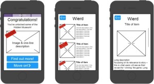
"Wireframe images within templates helped to keep content consistent"
“Wireframe images within templates helped to keep content consistent”

Themes began to emerge that could be interpreted in a really flexible way based on words such as ‘weird’ or ‘oops’, but these weren’t words that generally appeared in our databases and so we had to resort to pounding the galleries to create lists of possibilities.  In order to achieve a consistent approach, and for easier referencing whilst uploading content, we agreed that we would work to two templates: one that set out game content and the other museum ‘secrets’. The latter act as  the ‘rewards’ given to players after they complete each game in a tour. These are designed to be exclusive to the Hidden Museum experience  and so needed to be more revelatory  or anecdotal than anything that can be found on a museum label. Interesting discussions took place between the partners as to what words should or shouldn’t be used to describe each theme. The word ‘weird’ became ‘extraordinary’ since it was felt the former could have been easily misconstrued in a negative or insulting way , whilst ‘oops’ became ‘broken’ because that more adequately reflected the objects represented within the theme.

Journey

This is not the end of the road as far as my role is concerned since we will almost certainly need to refine the content based on our user testing and research. At the beginning of the project were were working in ‘sprints’ – the first round of these involved all project partners but then each one of us played different roles and had differing degrees of responsibility for its delivery over time. The technical and museum teams have now passed the baton well and truly to the research team who will be gathering data ready to feed back to us all  – can’t wait to see and hear the results!

Creating characters for our Hidden Museum app

We’ve been beavering away creating characters for our app. Creating a style for this exercised our grey matter somewhat!

We needed to create a look which complimented the very clean visual style that our lead designer for the project, Sarah Matthews created for the app. However, from our years of experience in creating characters for apps and games we know that younger children react much better to characters with an element of realism to them.

In user testing we trialed 3 potential styles:

A photographic style, using photographs of artifacts from around the museum:

Photographic character

A silhouetted style, which fits very well with the UI design, but is much less realistic in style:

Silhouette character

A geometric style, which is stylised like our UI design, but has much more realism:

Geometric character style

The overwhelming vote was for the geometric style, which thankfully our production team all liked too – so we decided to go down this route.

Next we had to decide what our characters should be – we had some ideas and Gail was great at helping us to hone these down. We wanted them to really represent the diversity of the exhibits at the museum, and also be appealing to all age groups and both males and females. So we settled on the ubiquitous dinosaur, George Peppard the boxkite pilot who flies the plane in the main hall, a chinese dragon head as represented in the chinese dragons over the stairs int he main hall, a roman goddess to represent the museum’s wealth of roman artifacts, a female Egyptian Mummy with gorgeous coloured paint and… Alfred the Gorilla (obviously!)

Here are the results!

All characters

Still a bit of work to do on the Mummy to make her a little more female, but more or less there.