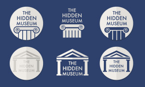
We decided that the logo designed previously was a little plain and did not really convey too much about the app itself, or reflect the essence of the app – so we have been working on the logo a little more.
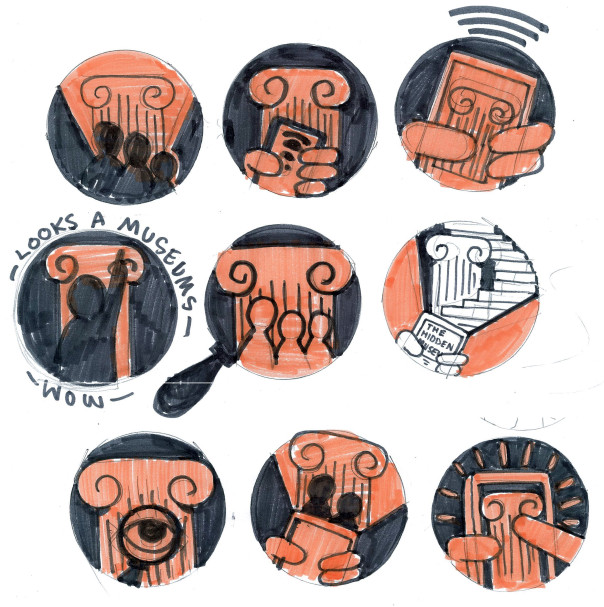
Rich Thorne nicely did some sketches to experiment with some concepts that might help to explain the app:
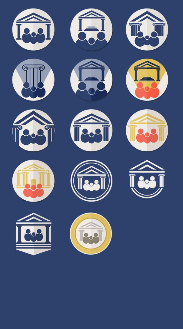
And Sarah experimented with some of these in our graphical style to see how they might work in practice.
We are concerned that it’s becoming a little too fussy and confusing so we might take a step back from this style soon. (The Museum and University also pointed out that it looks a little bit like a cartoon man with a moustache… can you see him?!)
